Evergreen PT
Date: Winter 2021
Instructor: Sarah Coppola
Tools: Figma, Photoshop
Team: Matt Latzke, Chris Baldour,
Jonathan Miller
This application was designed as part of HCDE 518 - User-Centered Design. In this ten-week course, my team and I chose a project area, developed a design question, conducted user research, defined a scope and user personas, and developed and delivered a working prototype of an application, built in Figma. I played in a key role in conducting research, designing the UX, and design documentation.
DESIGN QUESTION
How might we develop a more robust, inclusive, patient-centered, in-person/remote hybrid approach to physical therapy?
RESEARCH
Diary Studies
Our diary study was a three-day study with 3 individuals currently receiving PT treatment, one remotely and two in-person.
Over the course of the study, we gave participants a daily questionnaire about the nature of their at-home physical therapist treatment - the duration of their exercises; difficulty, format and setting of their exercises; their confidence doing the exercises; and what degree of communication they felt they needed from their PT throughout.
User Interviews
We interviewed 6 participants across varying age groups, technological skill levels, and injury type.
The participants that we interviewed were clearly split between two types of PT participants - those recovering from surgery, and those treating a specific ailment. We asked them a series of questions about their injury, relationship with PT, duration and difficulty of treatment, responses to both at-home and in-person care, and overall feelings about the PT process.
Online Questionnaires
We surveyed 18 participants who had experience as physical therapy patients within the past three years.
The participants varied in age, gender, and occupation, with the majority falling in the 25-40 years age group. About half of the participants were engaged in physical therapy prior to the COVID-19 pandemic and the other half were in therapy during the last two years. Our questions focused on a patient’s PT experience and success in at-home treatment.
RESEARCH FINDINGS
- Many patients tended to not follow through with their routine.
A third of patients reported completing half or less than their prescribed exercises, many indicating that following through on at-home exercises was moderately difficult.
- The experience varied depending on the type of injury patients were rehabbing.
Patients rehabbing larger injuries tended to do their exercise routine sequentially and in one location. These individuals had a number of phases to work through to return to some quality of life, but the understanding of these phases varied between interview patients. Patients rehabbing smaller injuries tended to do their exercises at various times throughout the day, in different locations.
- Patients didn't know how to advocate for themselves.
Some patients didn’t know the difference between good pain vs bad pain and didn't know how to ask the right questions to their therapist.
- Patients were unsure of their overall progress.
Patients reported uncertainty about whether they were completing the exercises correctly, felt like they had insufficient time to complete the exercises, and there was a lack of perceived meaningful progress. Many patients were left skeptical of physical therapy in general and didn't feel like it was doing anything.
- Understanding the reasoning behind exercises and how to do them could be a problem.
Almost all of the patients interviewed were given printouts to communicate which exercises they were to do. Some patients had no problem with these printouts, and others had trouble interpreting them. Many patients didn't have a clear understanding of how to do their exercises, or what they were supposed to be targeting.
PERSONAS
We used our research findings to develop several user personas to help us guide our application development.


DESIGN REQUIREMENTS
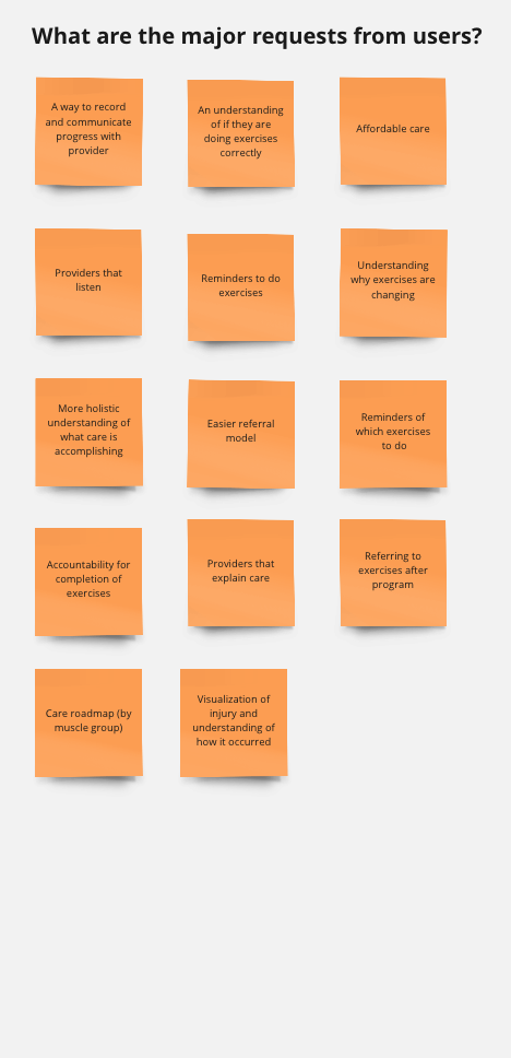
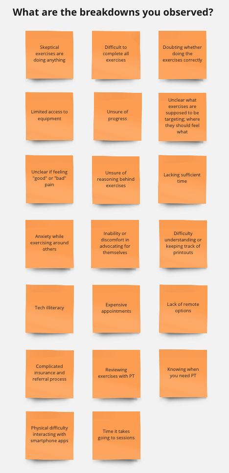
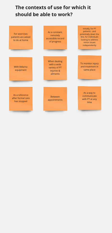
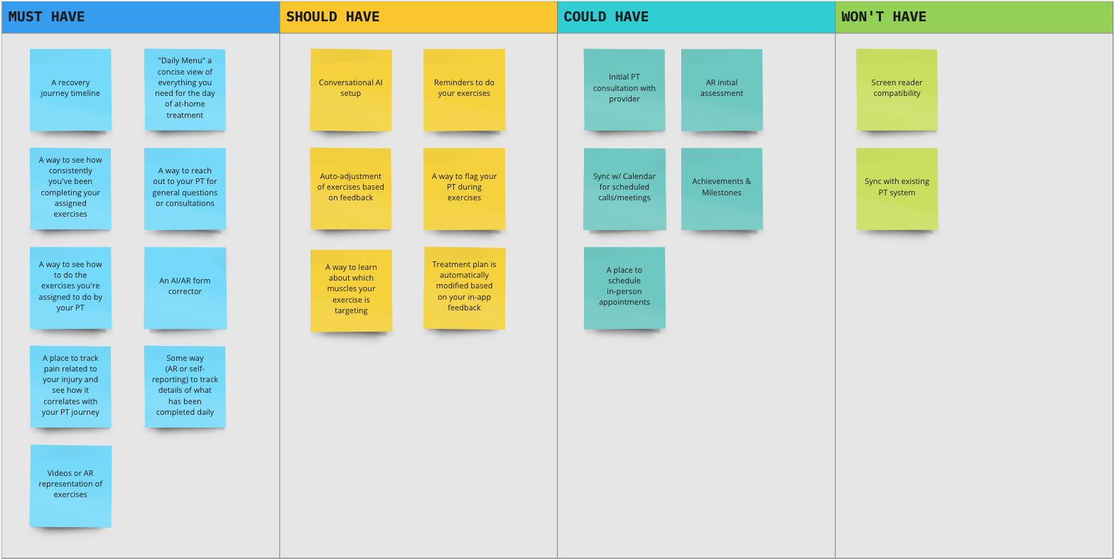
Once we compiled our research, we started brainstorming how our application could incorporate this feedback, and which of these issues we thought we may be able to address most effectively. We relied heavily on Miro whiteboards for this phase of the project, collaboratively laying out our thoughts and discussing as a team how we might approach these insights.
![]()
![]()
![]()
![]()
Honing in on what we wanted to accomplish and working through the pros and cons of each aspect as a team, we laid out a roadmap for the features in our application.
![]()
SKETCHING & IDEATION
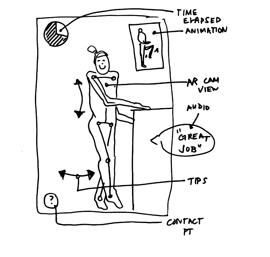
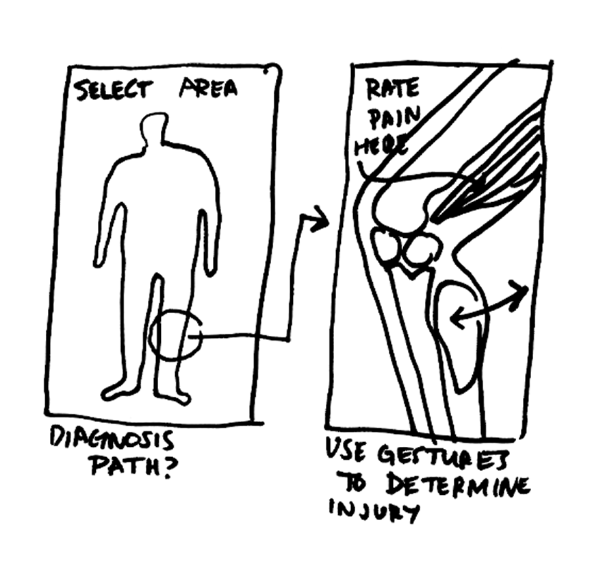
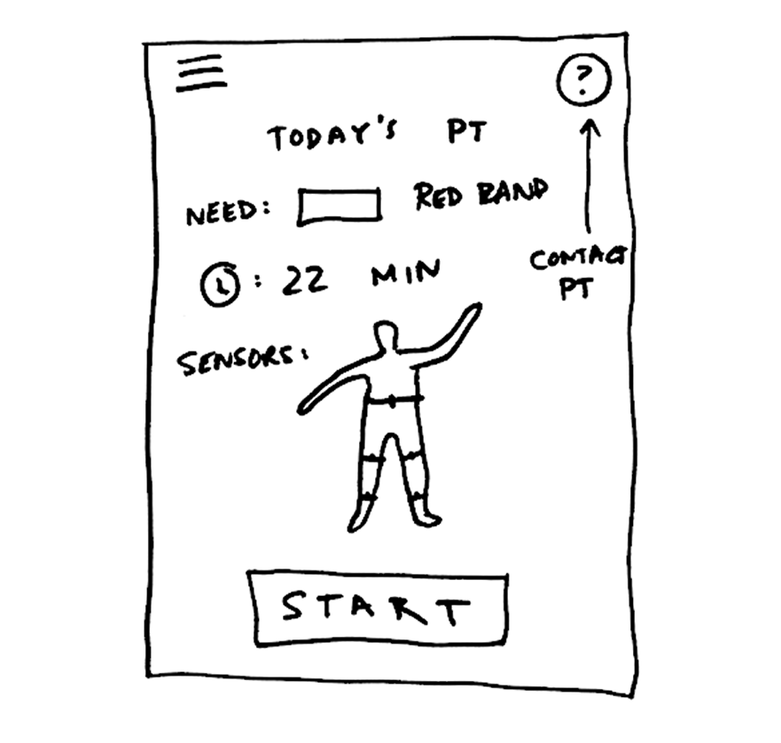
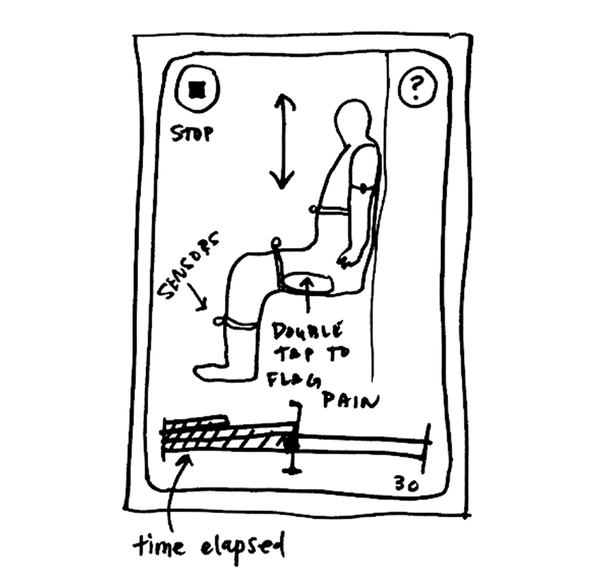
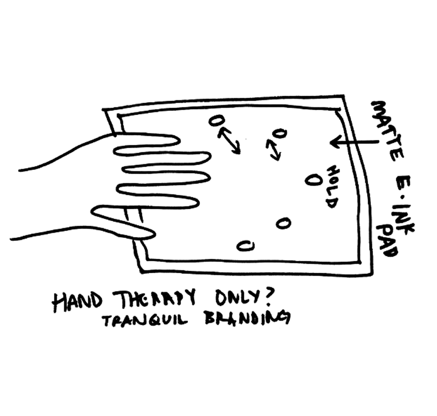
After we developed some functional targets, we got to work defining some of the interactions and visual aspects that might achieve these goals. The team produced sketches and wireframes to review within our group, as well as with our peers, our instructors, and potential users. Some of my sketches are included below:
![]()
![]()
![]()
![]()
![]()
Once we compiled our research, we started brainstorming how our application could incorporate this feedback, and which of these issues we thought we may be able to address most effectively. We relied heavily on Miro whiteboards for this phase of the project, collaboratively laying out our thoughts and discussing as a team how we might approach these insights.
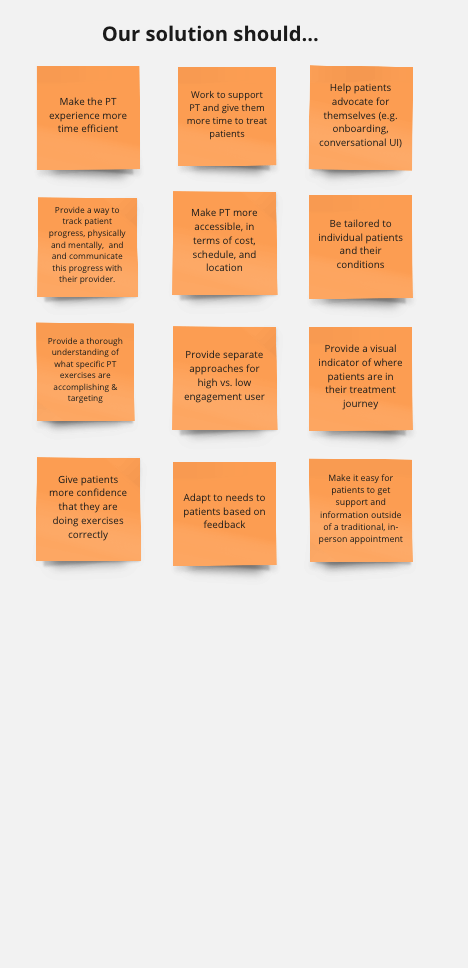
Honing in on what we wanted to accomplish and working through the pros and cons of each aspect as a team, we laid out a roadmap for the features in our application.
SKETCHING & IDEATION
After we developed some functional targets, we got to work defining some of the interactions and visual aspects that might achieve these goals. The team produced sketches and wireframes to review within our group, as well as with our peers, our instructors, and potential users. Some of my sketches are included below:
USER FLOWS
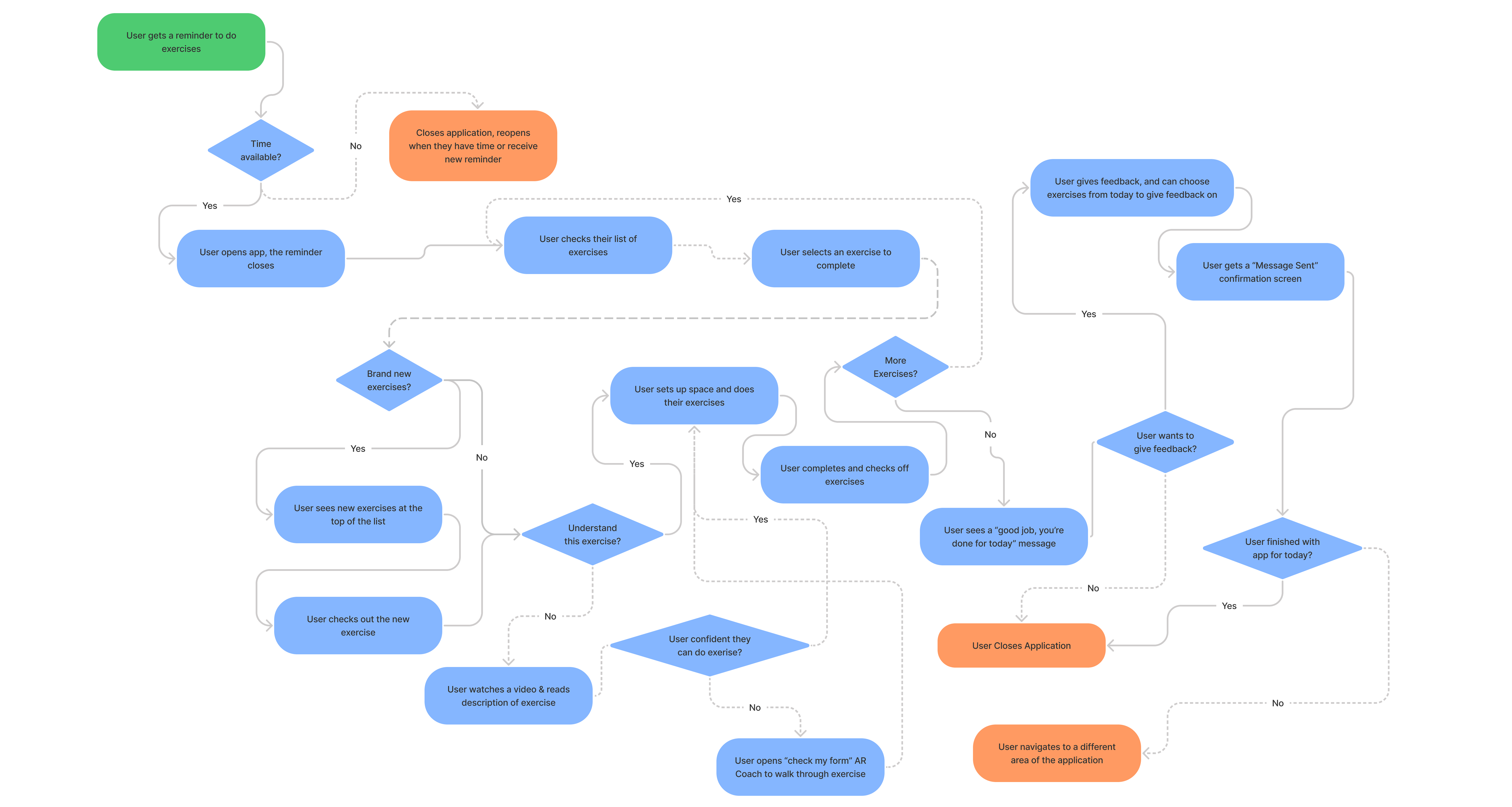
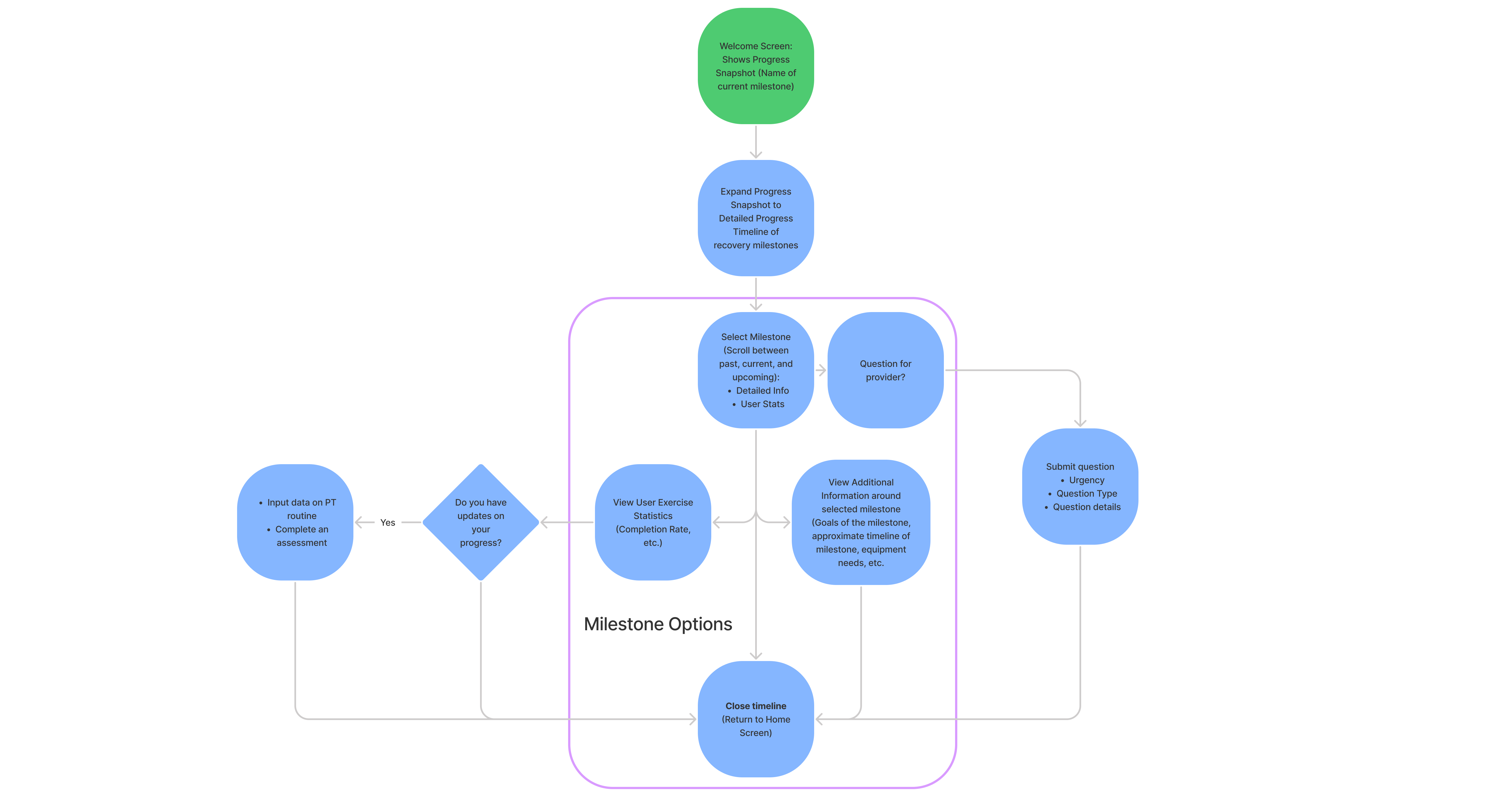
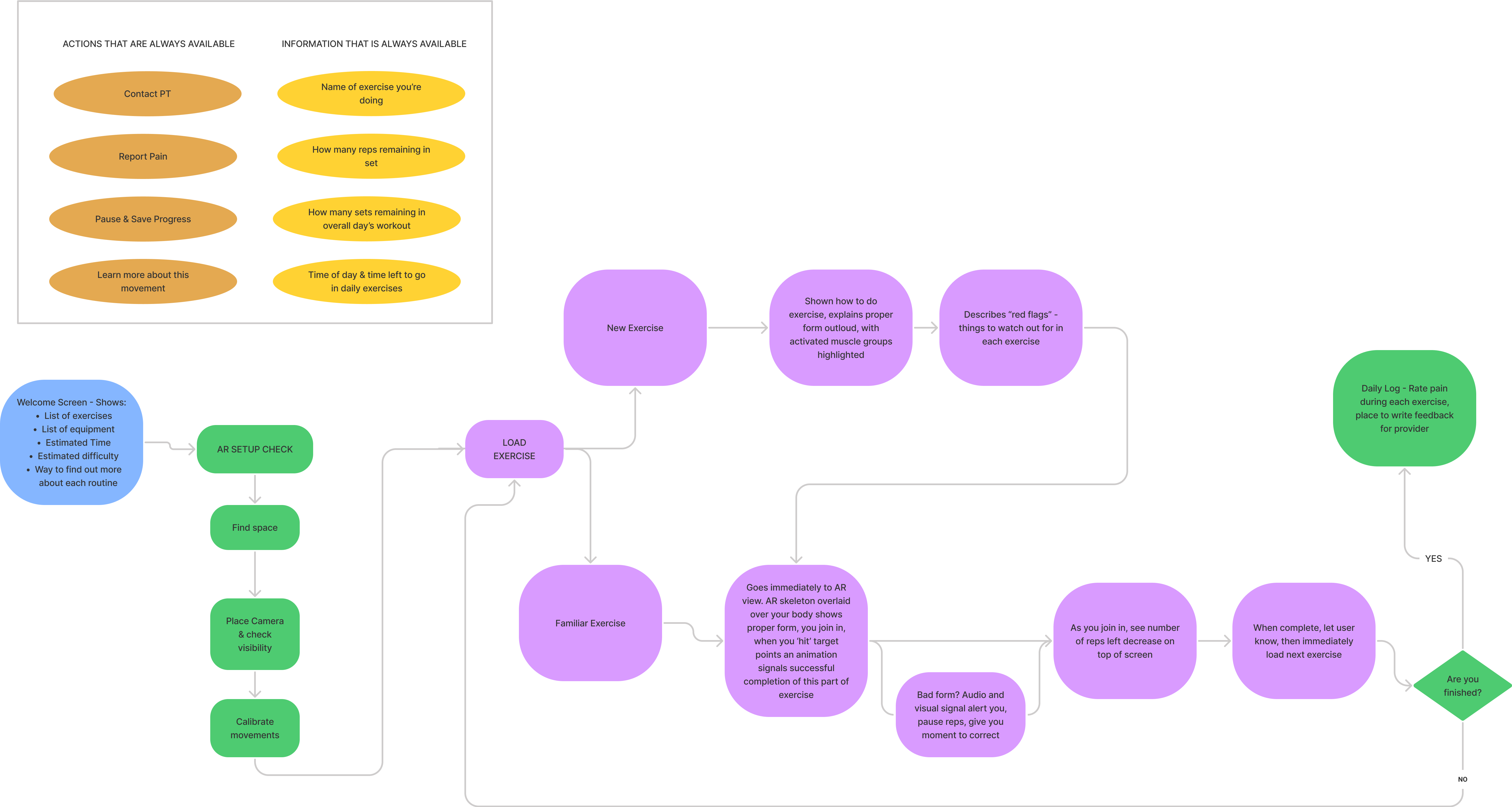
Our team started to think of the application as a series of actions a user needed to take - to contact their therapist, view and complete their exercises, and see their general progress in treatment and status. We began to work through some of these processes as flow charts to structure the development of our prototype.

PROTOTYPE
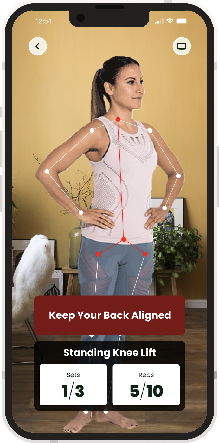
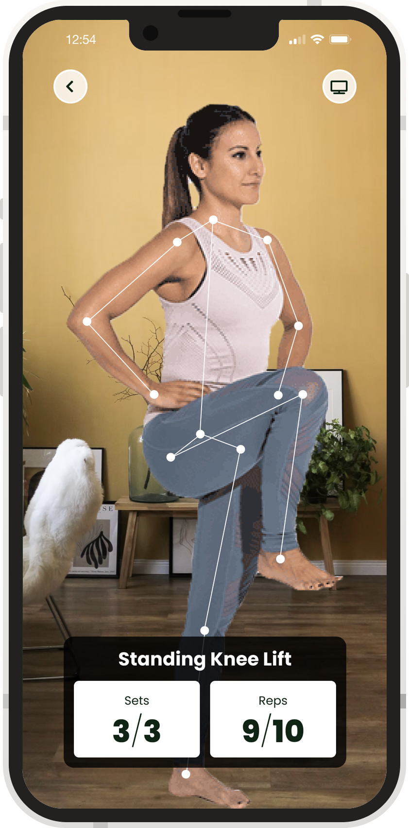
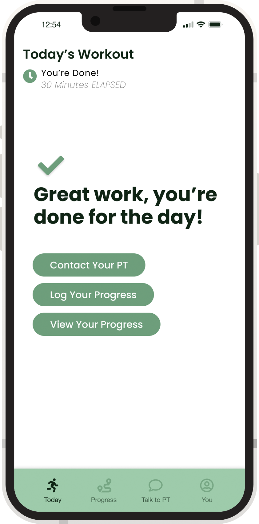
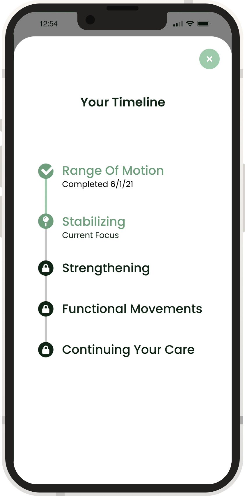
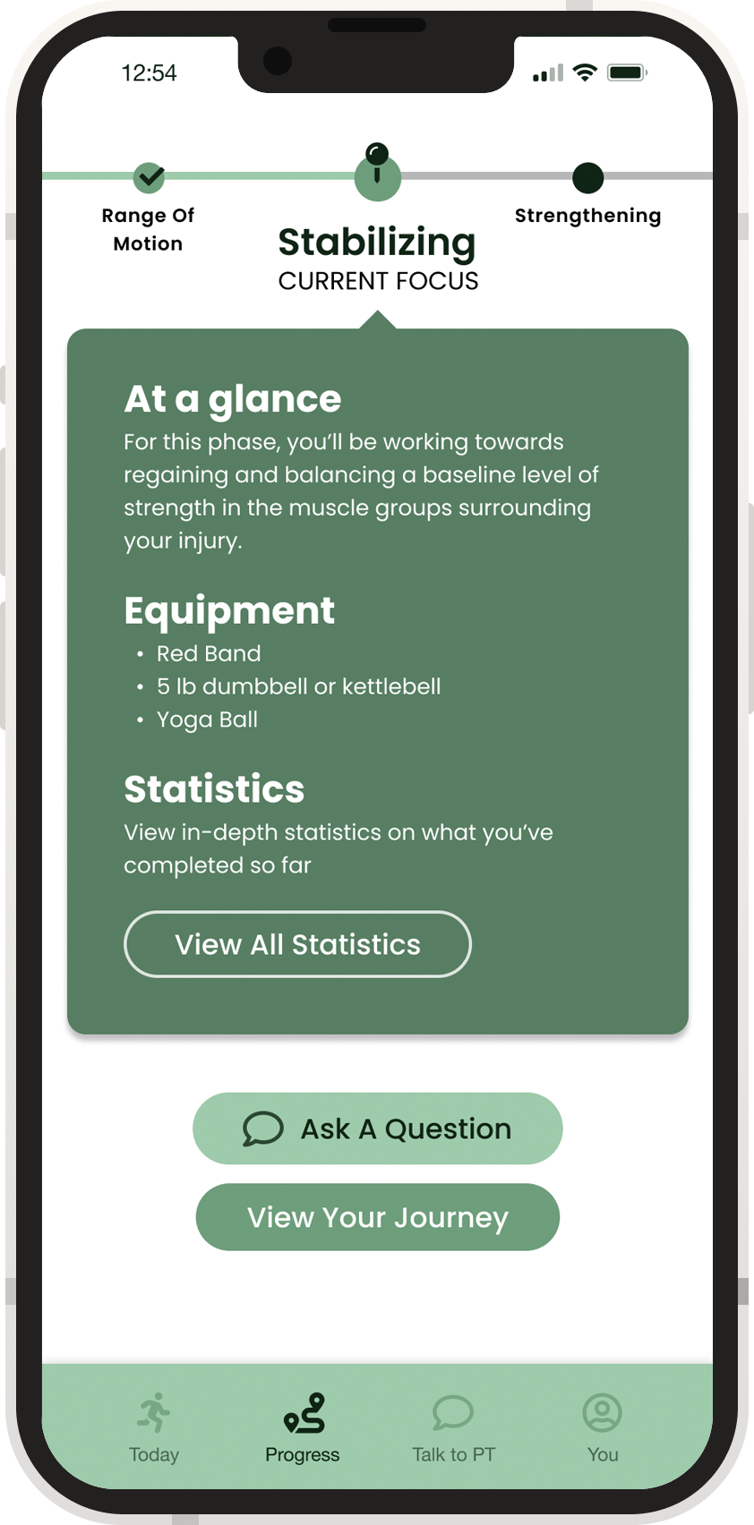
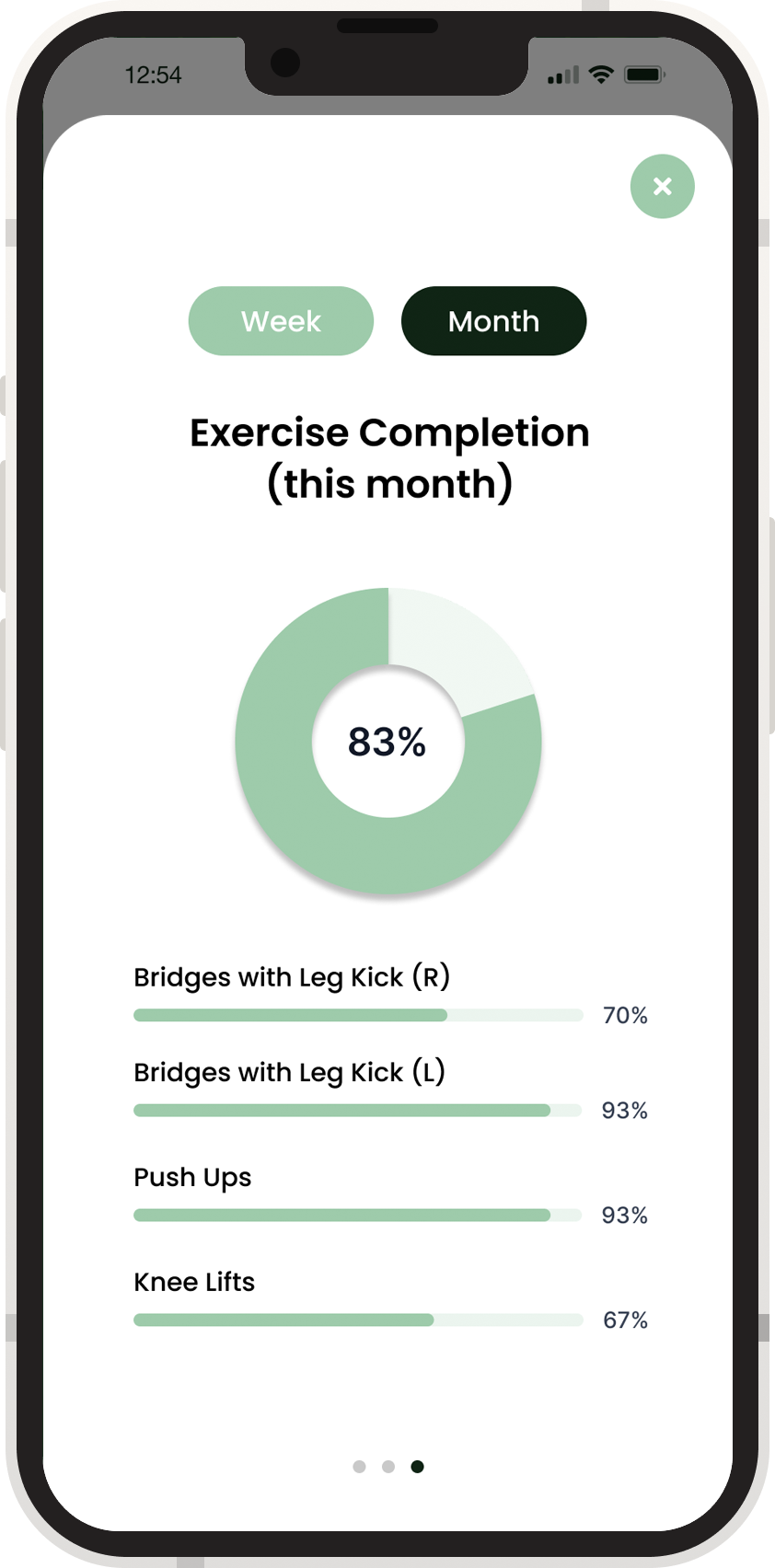
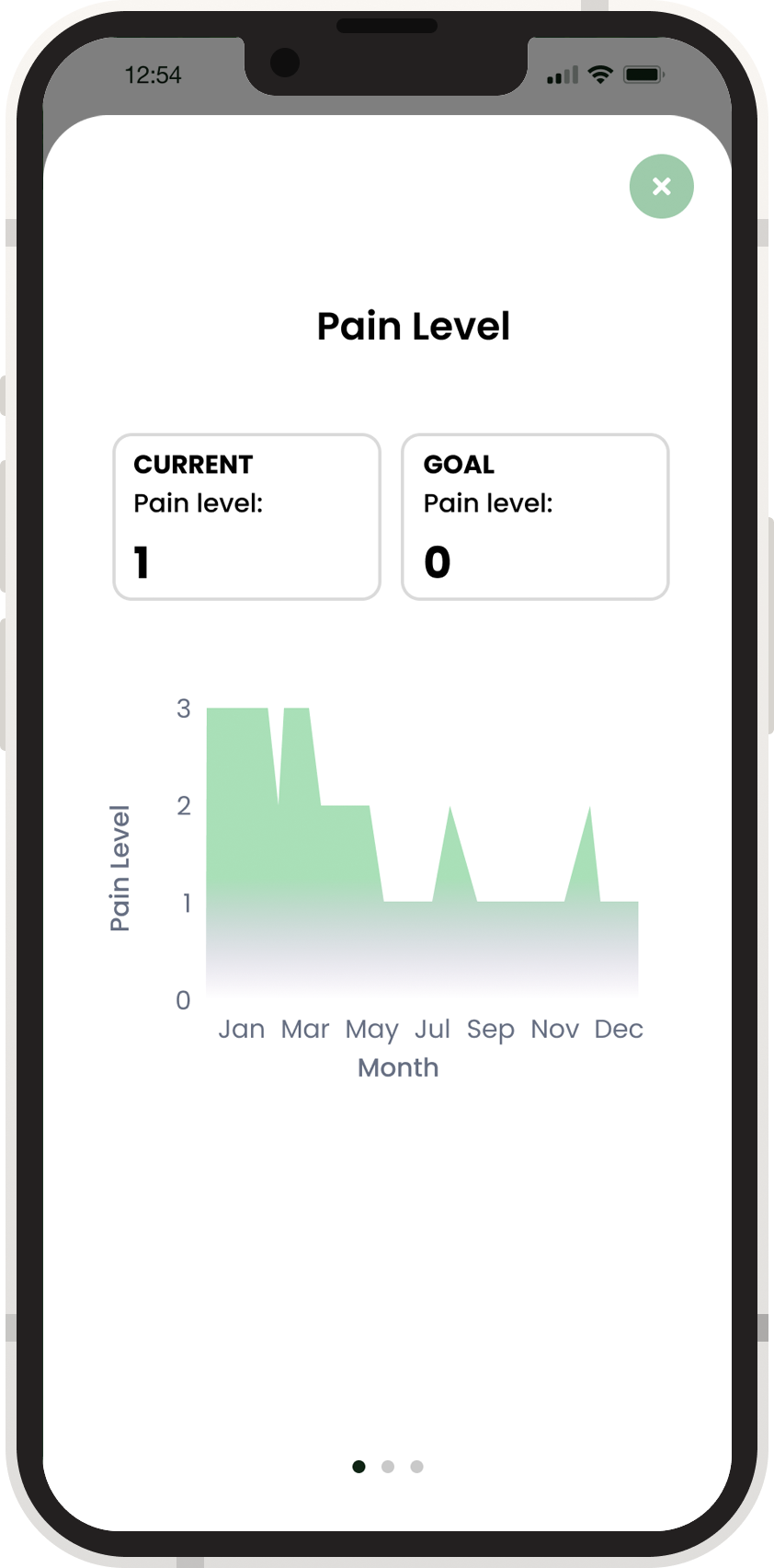
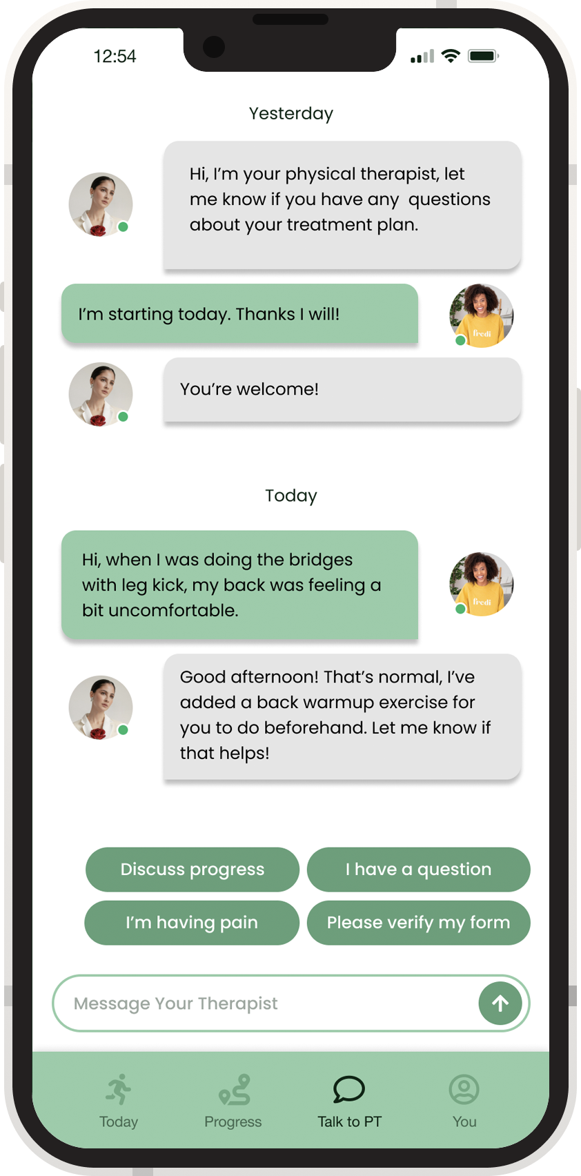
Finally, our team was ready to build out our prototype! Working together in Figma, we iterated our screens and interactions and watched our ideas come to life. Throughout the prototyping phase, we gathered feedback from peers and users and refined our user experience and visual language.
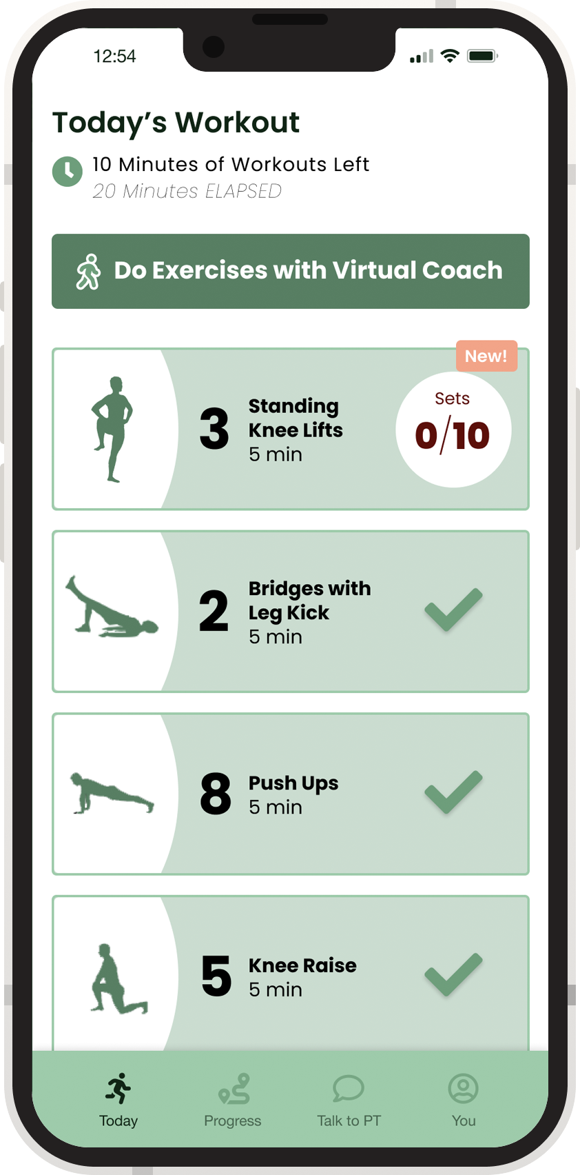
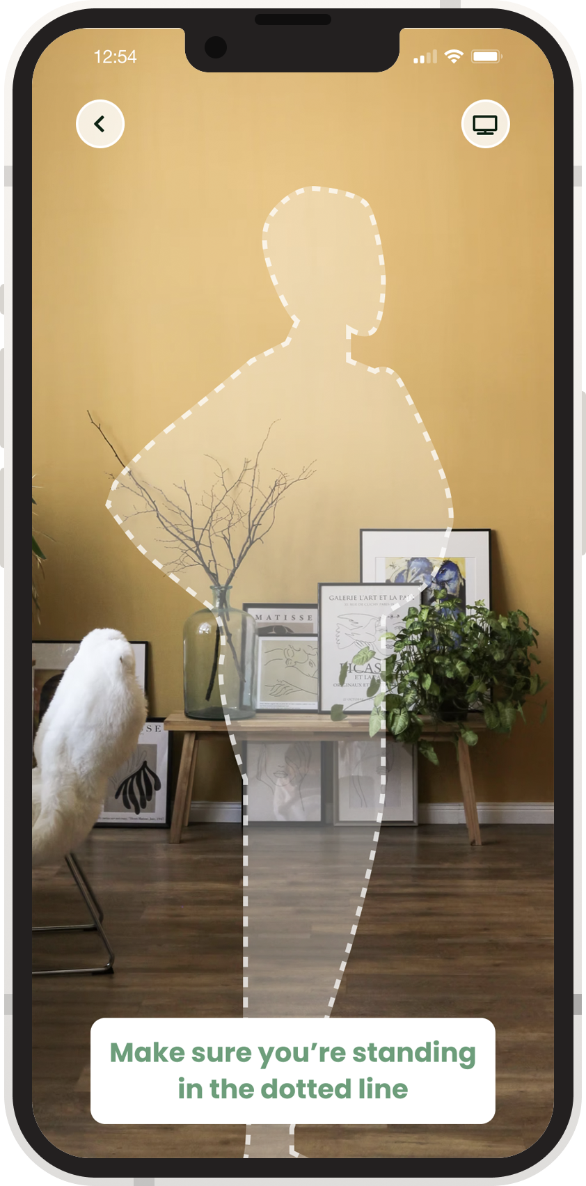
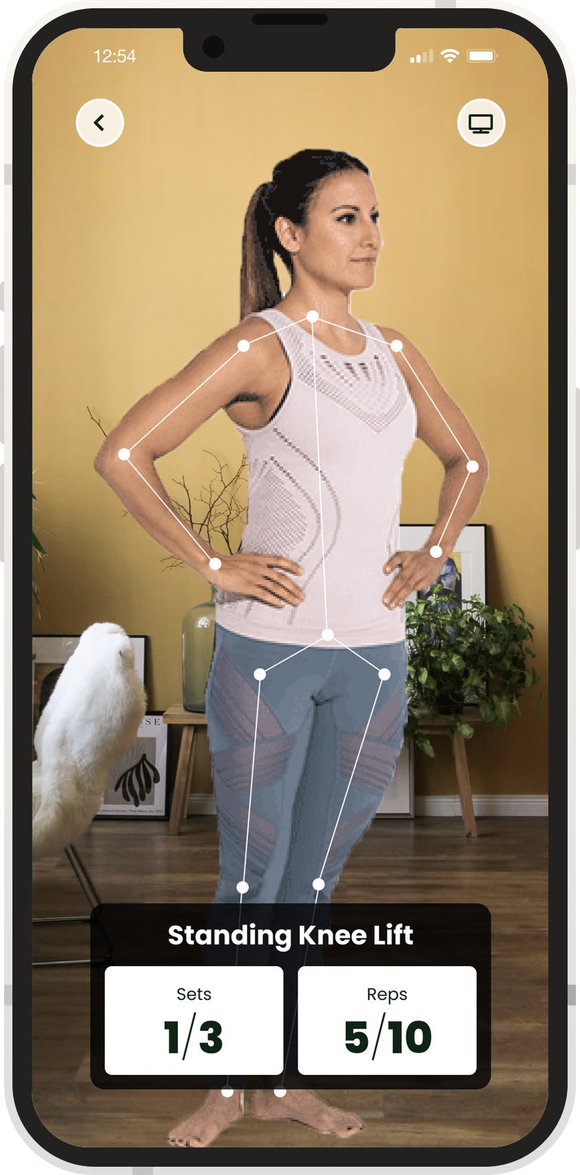
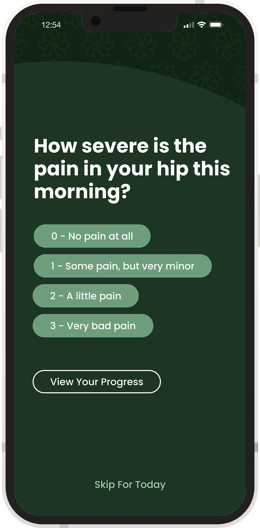
Still images from the prototype can be flipped through below. We tried to keep the color palate limited, keep text to a minimum, and make it easy for users to get more information.

For our class presentation, we made a promotional video for our application, highlighting the narratives of our potential users.
