Heartfelt
Date: 2019
Artist: Ekene Ijeoma
Fabrication: DCM Fabrication Inc.
Programming: Patten Studio
Location: Kennedy Center, Washington DC
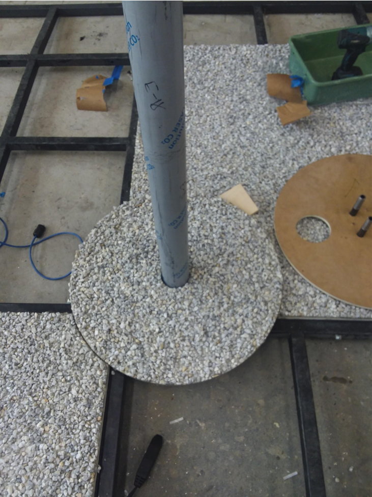
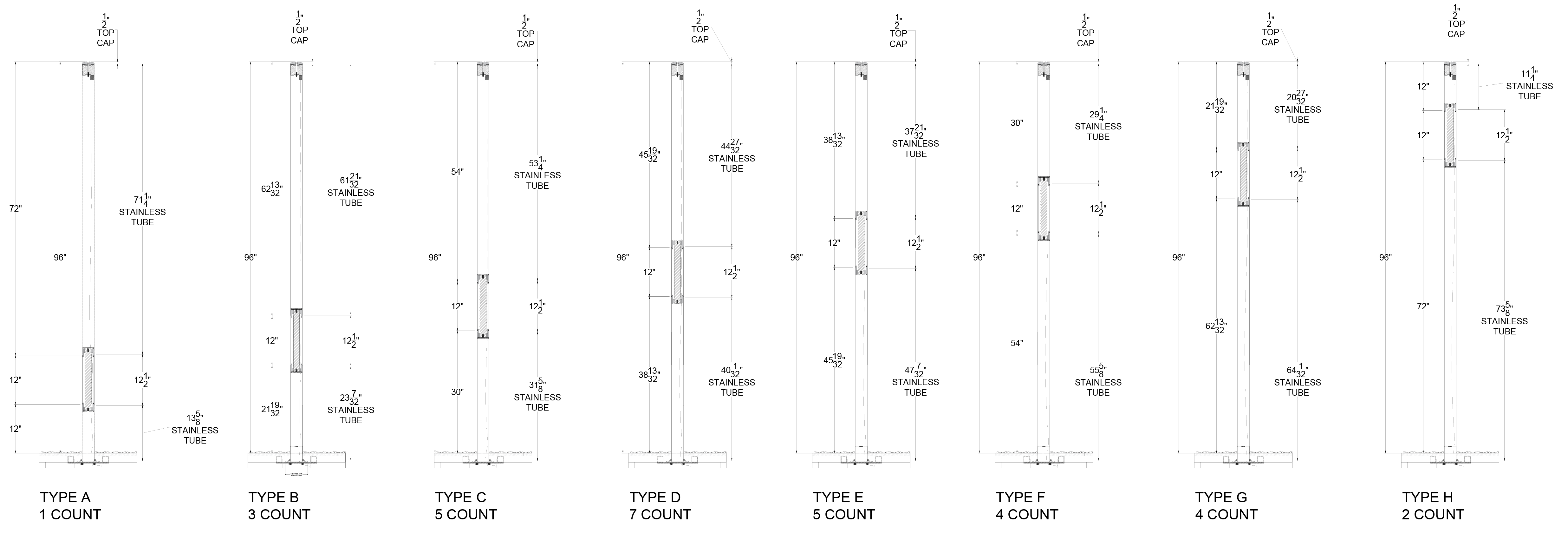
For this permanent public artwork for the Kennedy Center, I was in charge of design development, the production of all 3D models and drawings, and managing the physical prototyping and fabrication process. The artist’s vision involved a network of seamless polished stainless steel veritcals, which would illuminate when people used their bodies to complete the circuits. We were responsible for designing and building a weatherproof outdoor system that could support this vision, and providing a clear and concise install guide for the venue.
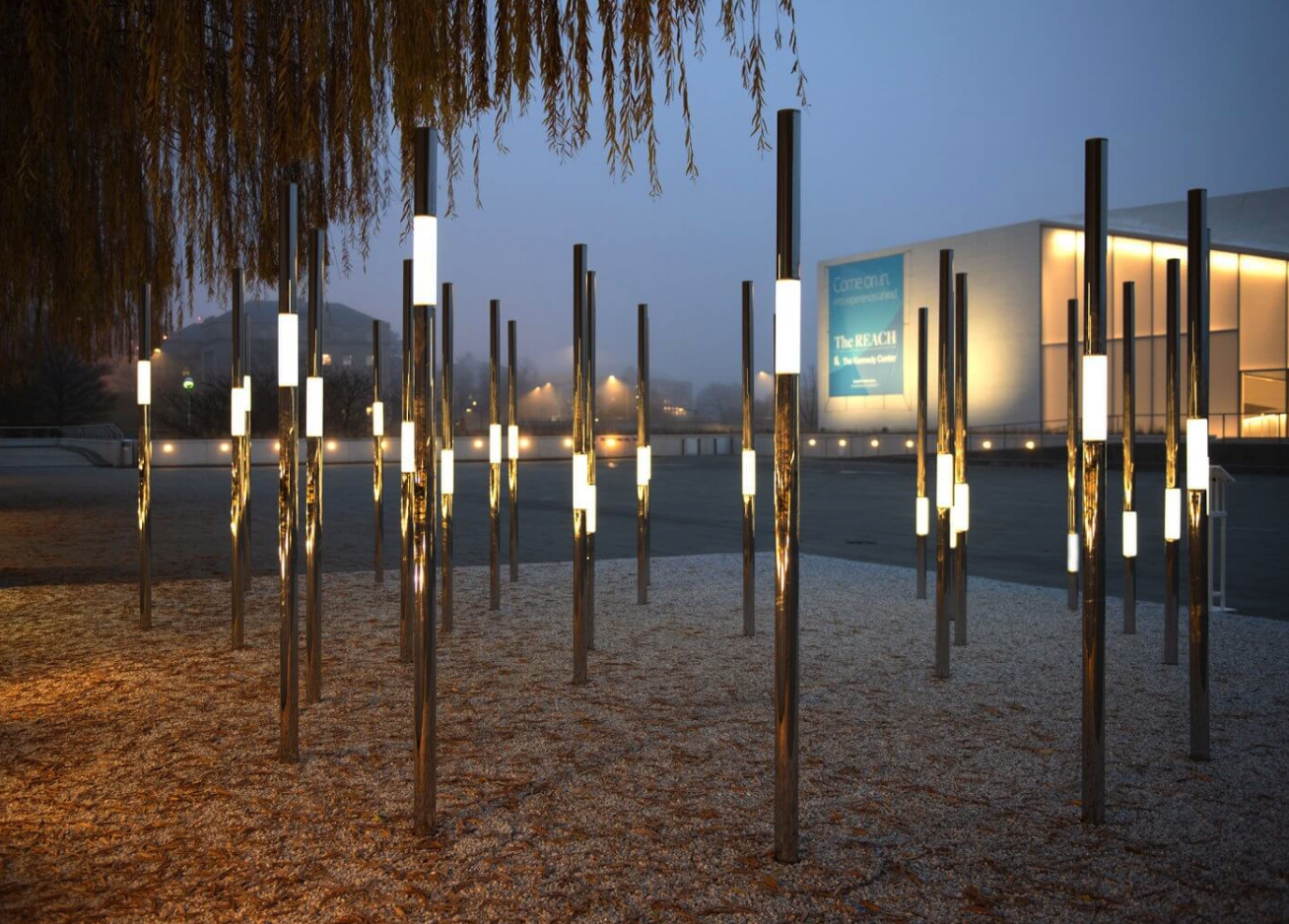
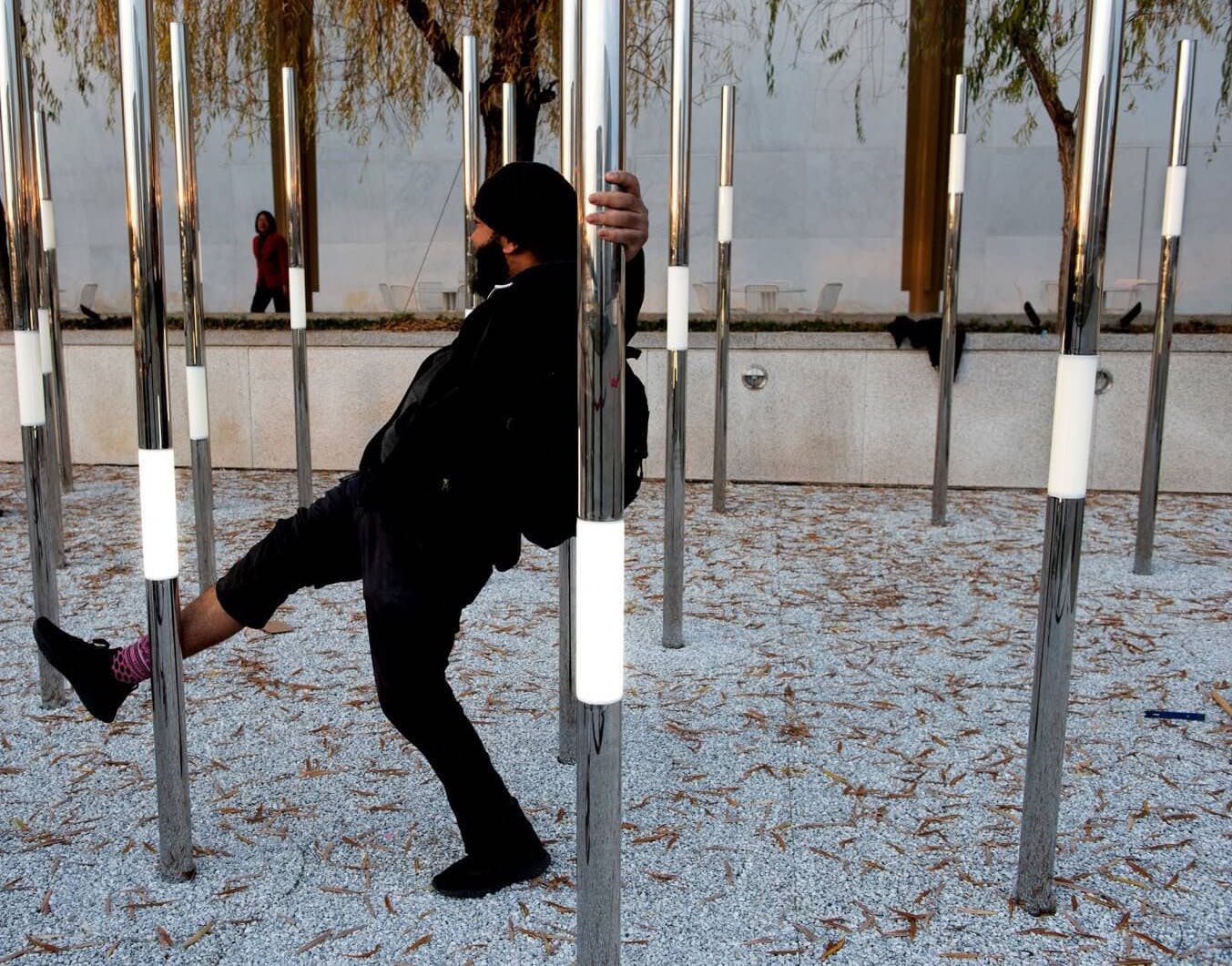
Photo Credit: Photos of installed piece are by Patten Studio, production photos are my own
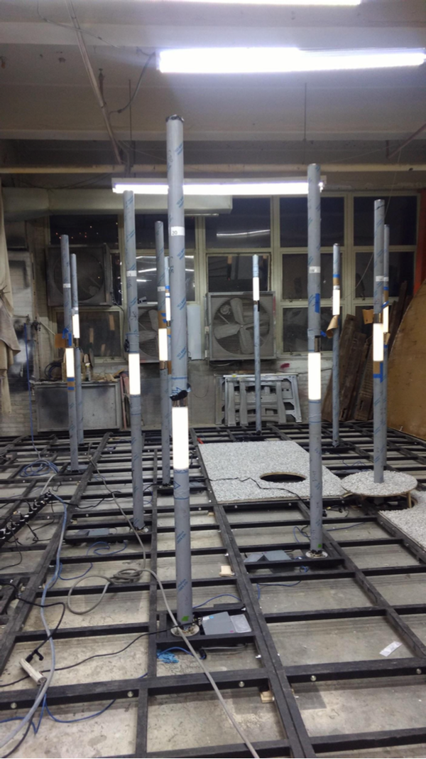
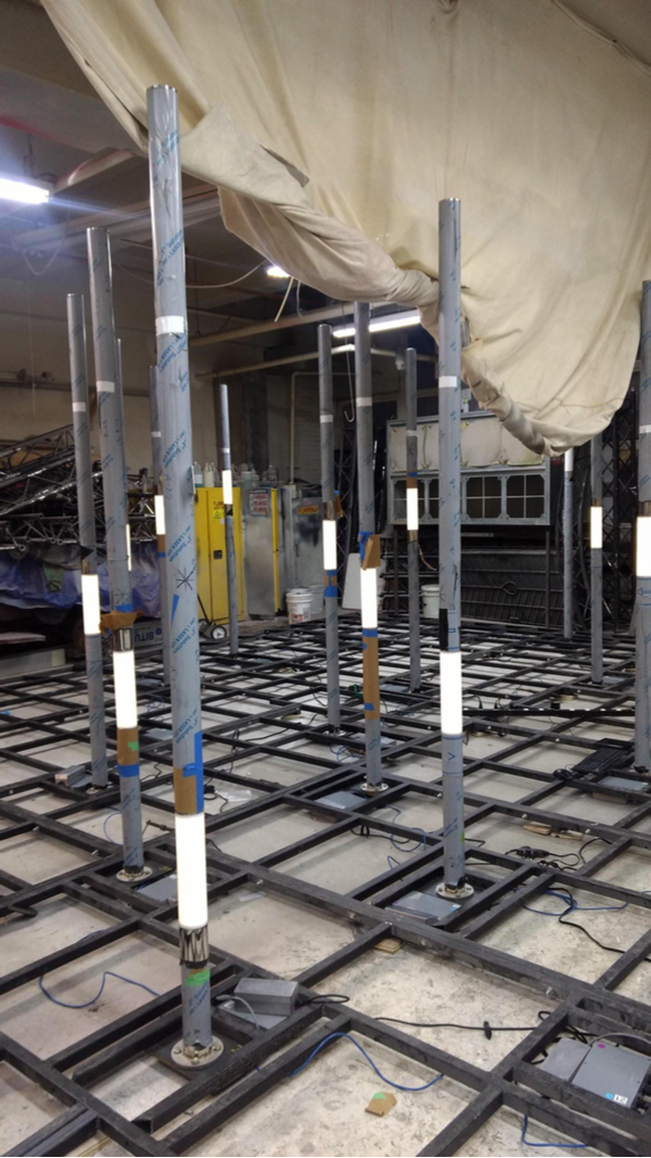
The artwork needed space for hardware below the ‘ground’ level, and also needed all electrical components to be isolated. I was responsible for laying out a framework to support the poles and the hardware specs, sourcing all materials, designing the physical lighting component, and designing custom milled aluminum parts that could accommodate the lighting and wiring of the piece without compromising the hand-to-hand circuit.
Haystack
Date: 2015
Company: Dendrite Corp.
Haystack, a now-defunct aggregated search engine for licensable, professional photography, required a sleek and easy-to-navigate user interface to set it apart from other stock image sources. From wire frame to final mock ups, I worked to refine the functions down to the bare essentials, and build clear, minimal menus. I also handled the branding tone and content, writing site copy & producing illustrations.
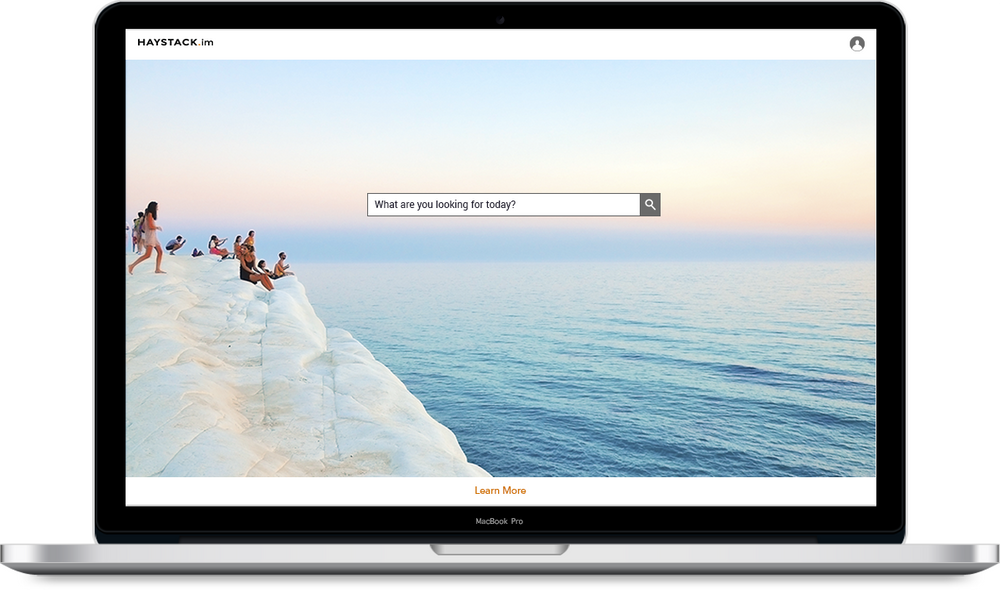
The Haystack landing page was an opportunity to highlight the simplicity of our format, and also showcase the work of our affiliated photographers.
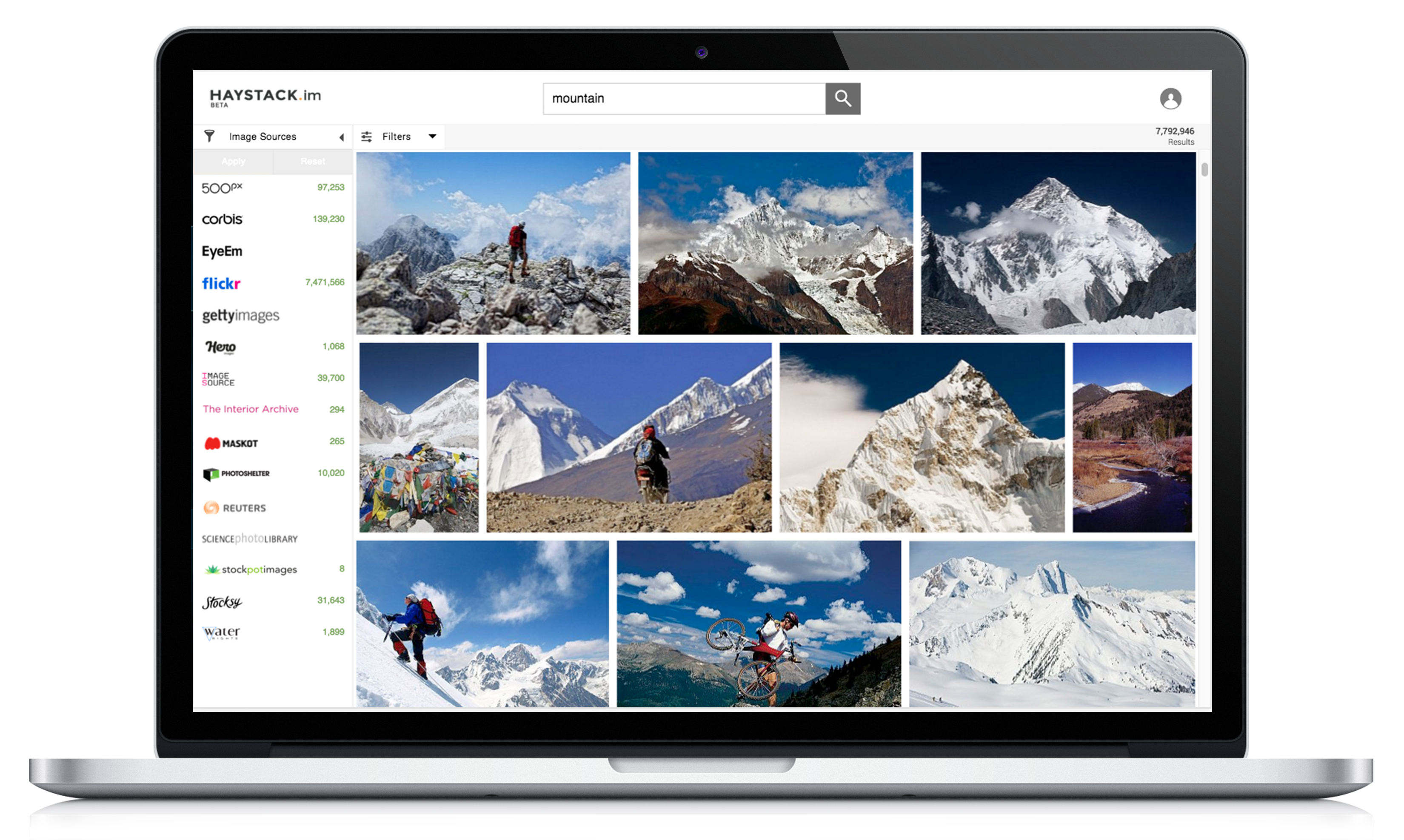
Our search results were quick and highly customizable - here, a user can view the various stock image sources shown in results, and filter by source. Images could also be sorted by license type, size ratio, resolution, and date added.

Haystack was unique in that it offered the ability to produce a cross-source lightbox, which could be shared. This made it easier for photo editors to collaborate, replacing the typical practice of downloading low-resolution test images and producing file folders. I developed this feature, and was responsible for the UI/UX.
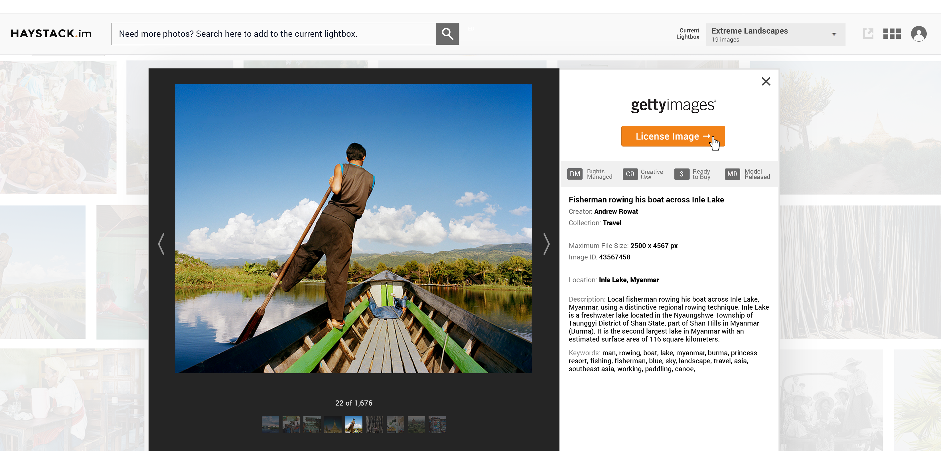
When users enlarged an image, they could view all relevant metadata and license it directly from the provider. Down the line, we planned to incorporate a purchasing environment of our own.
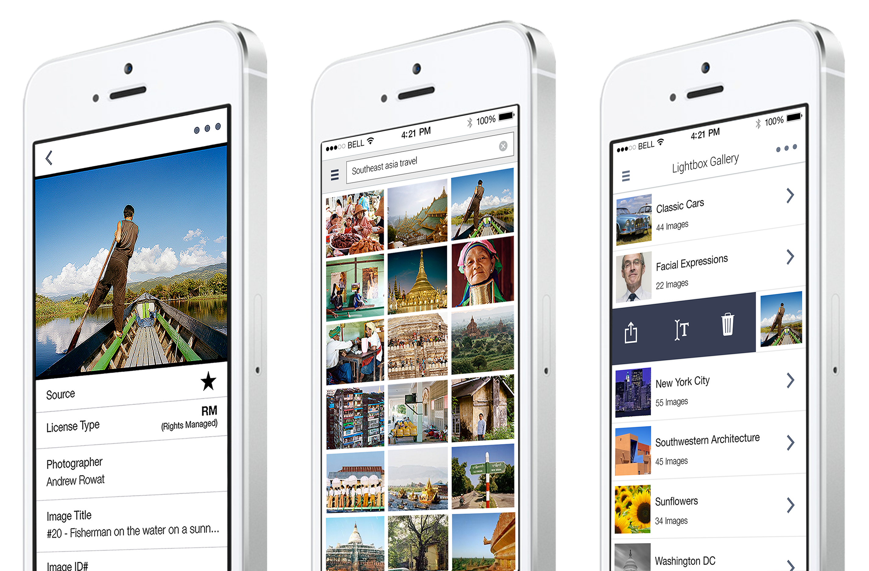
I was also responsible for designing the mobile application, which was similarly simple and easy-to-use.
Haystack
Guys
Date: 2015
For Haystack's first branding concept, I was asked to develop a mascot that we incorporated into the site, decks and emails. We wanted to keep the tone light and humorous. The illustrations below show selected images featuring these characters, with the corresponding copy text below.
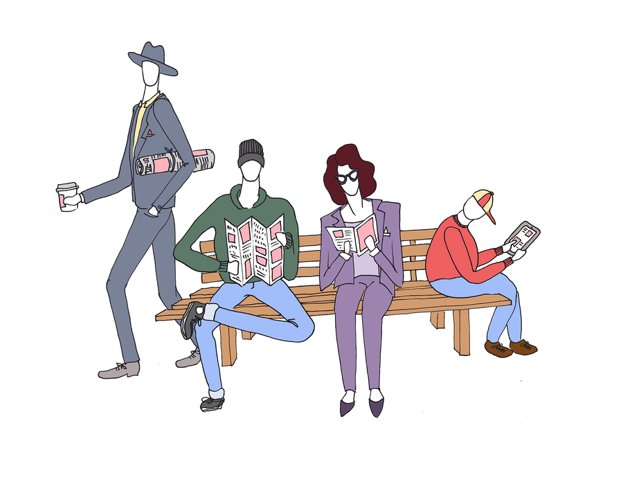
Stock photography is everywhere!
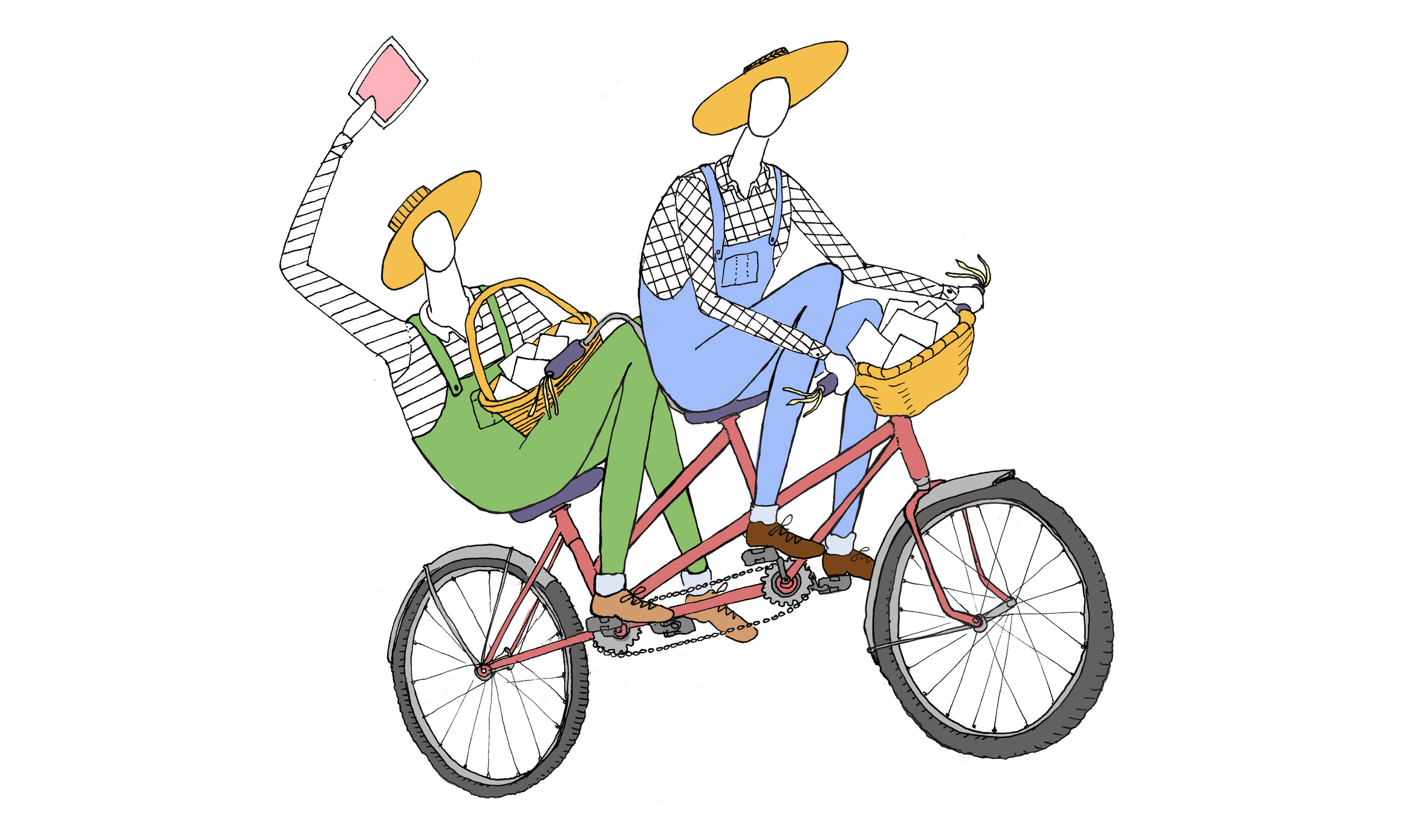
It’s easier to deliver quality content when you’re working with a team.

Finding quality stock photography takes a discerning eye.
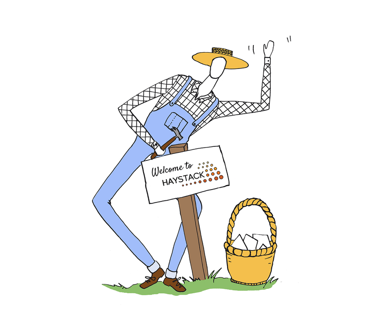
Welcome to Haystack!
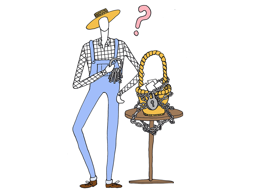
Lost your password?
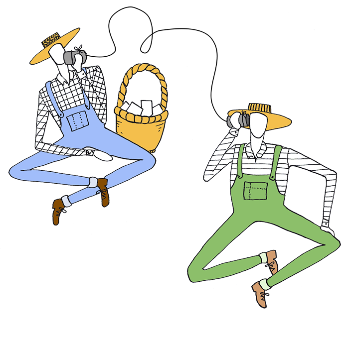
We make it easier to communicate with your team.
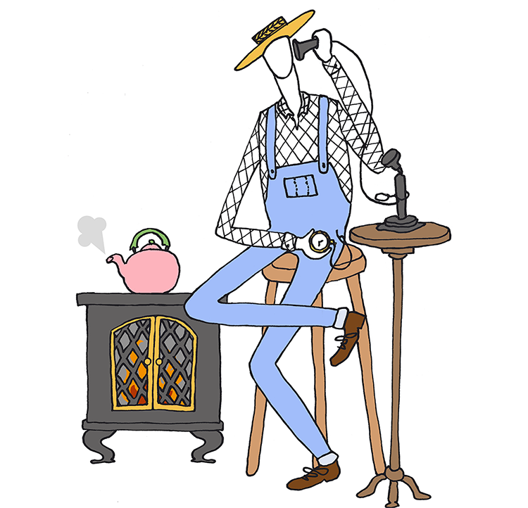
Do you ever feel like you’re doing things the old-fashioned way?

Introducing our comments feature.

Happy Canada Day!
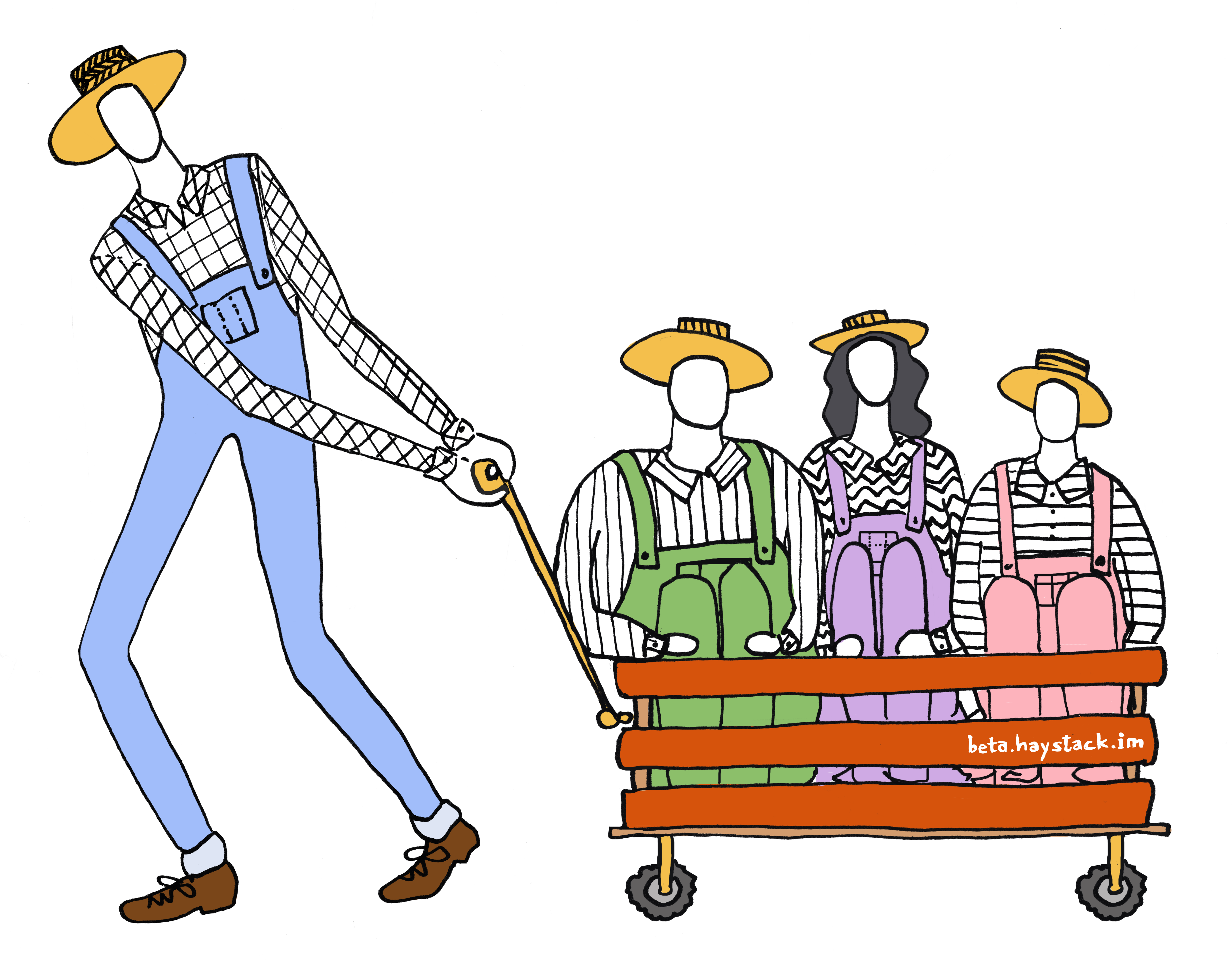
Tell all your friends to try our beta version!

Our mascot’s retirement.
Bitcoin Ballet
Date: Winter 2021
Instructor: Adi Azulay
Tools: Arduino, Python
This project, completed as a final project for HCDE 539: Physical Computing, is a prototype for a larger, in-progress art piece, which aims to present the ebb and flow of financial data as a choreographed dance performed by music-box ballerinas.
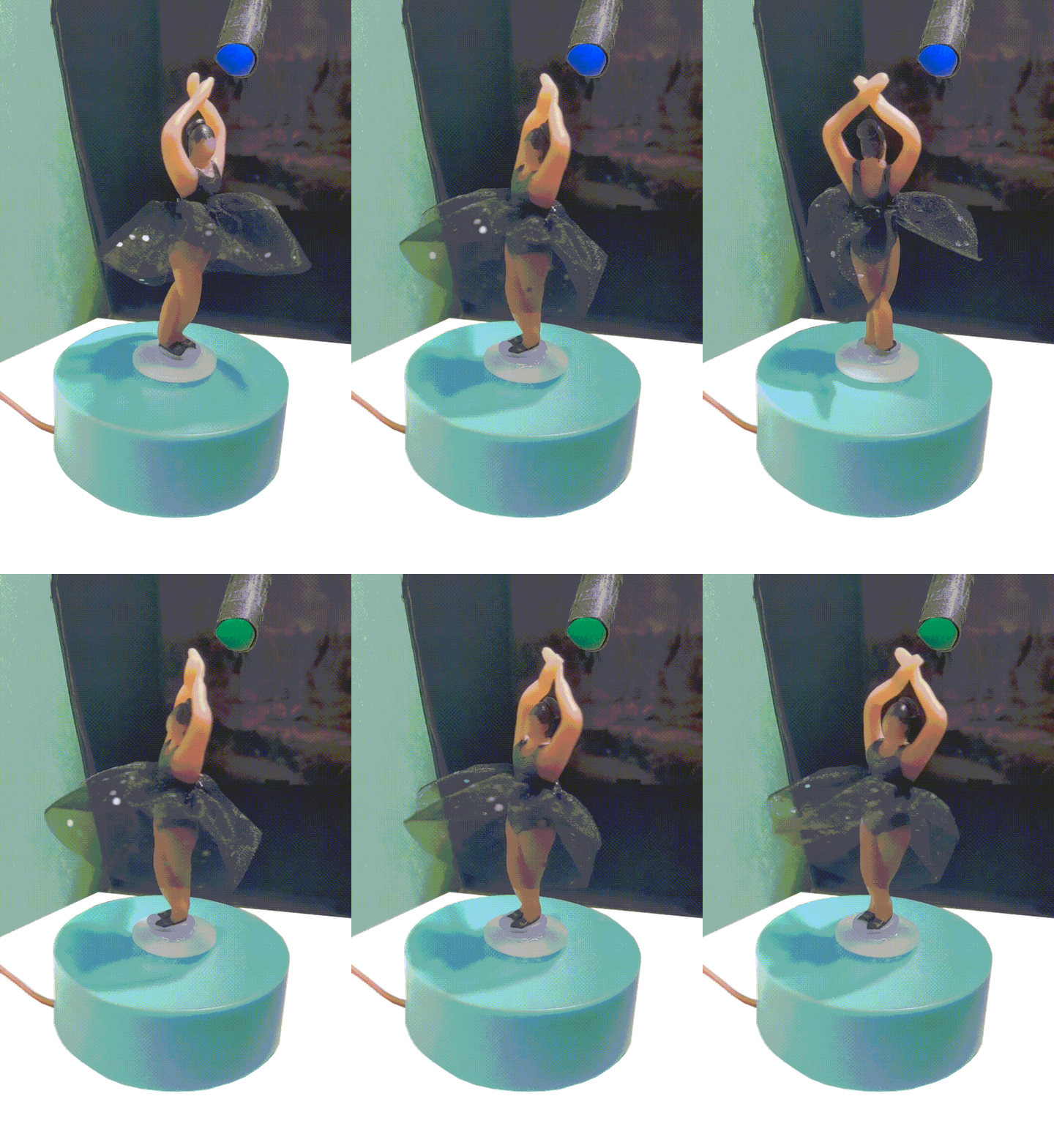
For my physical computing final, I decided to prototype a concept that involved representing fluctuating financial data with an array of spinning music-box dancers.
Using the yfinance API for live financial data, I used Python and Arduino to program this oven-bake clay ballerina’s servo motor to spin faster or slower depending on the rate of change between the current and previous price of Bitcoin. Her stage lighting and spin direction would also shift, depending on if prices were rising or falling.
![]() The above shows a sketch of my overall concept, to show the stock prices of the top 5 US employers. This Bitcoin dancer served as proof of concept for this larger piece.
The above shows a sketch of my overall concept, to show the stock prices of the top 5 US employers. This Bitcoin dancer served as proof of concept for this larger piece.
Using the yfinance API for live financial data, I used Python and Arduino to program this oven-bake clay ballerina’s servo motor to spin faster or slower depending on the rate of change between the current and previous price of Bitcoin. Her stage lighting and spin direction would also shift, depending on if prices were rising or falling.
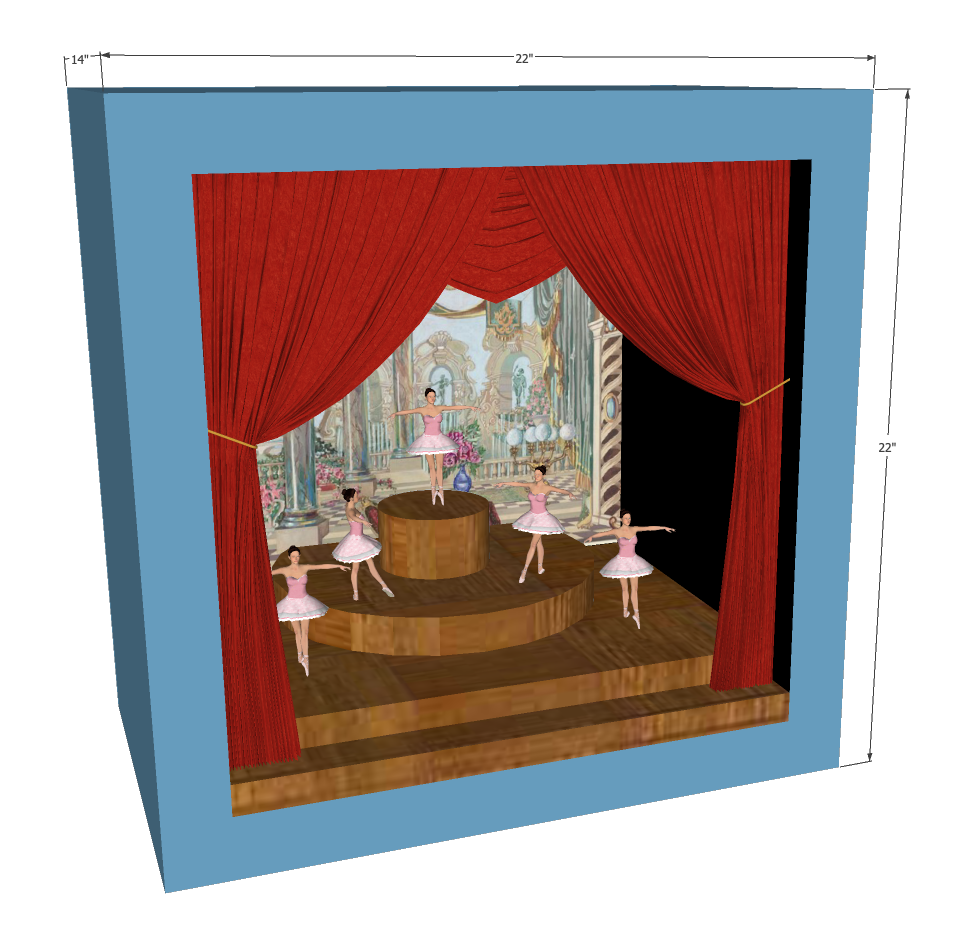 The above shows a sketch of my overall concept, to show the stock prices of the top 5 US employers. This Bitcoin dancer served as proof of concept for this larger piece.
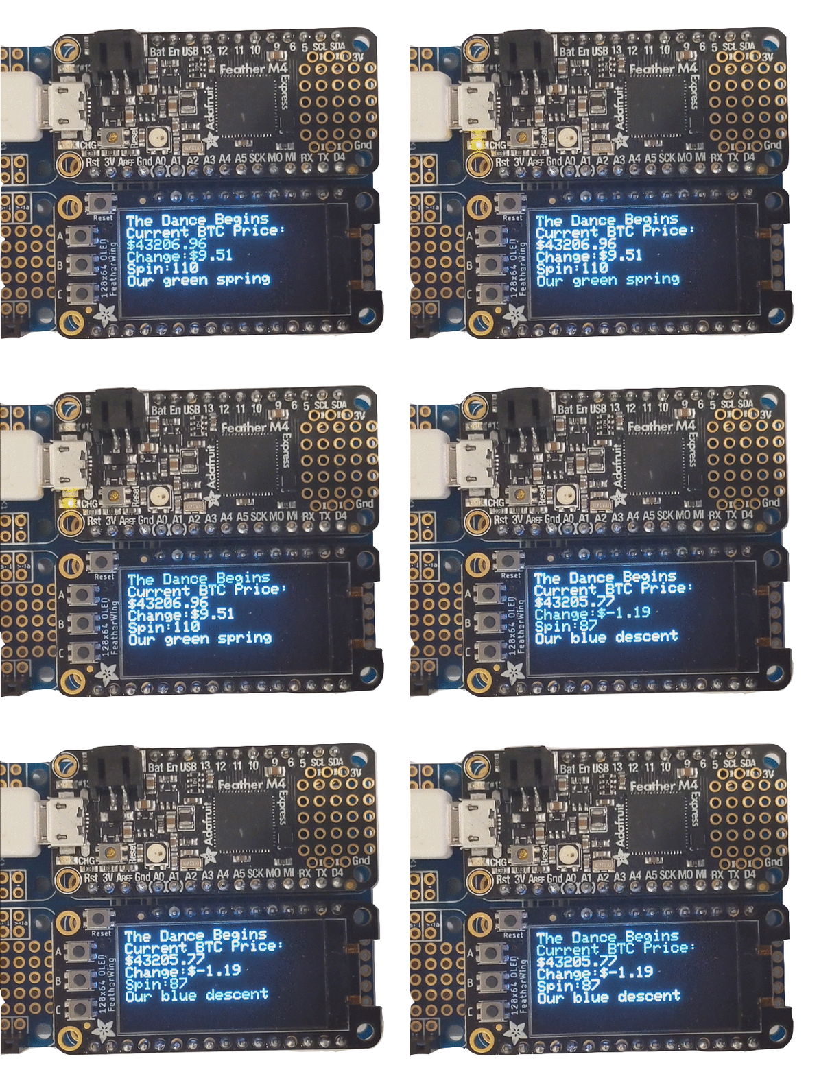
I programmed an OLED screen to monitor the system, which let me know how price and spin rate were changing.
Initially, my goal was to build a dancing model of a segment of the stock market - but as I began to build it, I found that both the small degrees of shifts in price and the limitations of market hours made it difficult to test my system. BitCoin’s 24-hour volatility made it a great candidate for my first prototype, as it was easy to tell when things were and werent working.
I also began my system without using an OLED screen, and I was often uncertain if the dancer was responding to the data I intended. Adding the screen to my board gave me a way to get live feedback from the system, which I couldn’t do when using the serial monitor to link my Arduino and Python code.


For my initial setup, I positioned the ballerina inside a carboard box ‘stage’ with the lighting installed overhead. Her performance would begin whenever a user opened the stage door, which would trigger a magnetic door sensor and turn on the motor, LED, and OLED screen.
This video shows the system in action:
Evergreen PT
Date: Winter 2021
Instructor: Sarah Coppola
Tools: Figma, Photoshop
Team: Matt Latzke, Chris Baldour,
Jonathan Miller
This application was designed as part of HCDE 518 - User-Centered Design. In this ten-week course, my team and I chose a project area, developed a design question, conducted user research, defined a scope and user personas, and developed and delivered a working prototype of an application, built in Figma. I played in a key role in conducting research, designing the UX, and design documentation.
DESIGN QUESTION
How might we develop a more robust, inclusive, patient-centered, in-person/remote hybrid approach to physical therapy?
RESEARCH
Diary Studies
Our diary study was a three-day study with 3 individuals currently receiving PT treatment, one remotely and two in-person.
Over the course of the study, we gave participants a daily questionnaire about the nature of their at-home physical therapist treatment - the duration of their exercises; difficulty, format and setting of their exercises; their confidence doing the exercises; and what degree of communication they felt they needed from their PT throughout.
User Interviews
We interviewed 6 participants across varying age groups, technological skill levels, and injury type.
The participants that we interviewed were clearly split between two types of PT participants - those recovering from surgery, and those treating a specific ailment. We asked them a series of questions about their injury, relationship with PT, duration and difficulty of treatment, responses to both at-home and in-person care, and overall feelings about the PT process.
Online Questionnaires
We surveyed 18 participants who had experience as physical therapy patients within the past three years.
The participants varied in age, gender, and occupation, with the majority falling in the 25-40 years age group. About half of the participants were engaged in physical therapy prior to the COVID-19 pandemic and the other half were in therapy during the last two years. Our questions focused on a patient’s PT experience and success in at-home treatment.
RESEARCH FINDINGS
- Many patients tended to not follow through with their routine.
A third of patients reported completing half or less than their prescribed exercises, many indicating that following through on at-home exercises was moderately difficult.
- The experience varied depending on the type of injury patients were rehabbing.
Patients rehabbing larger injuries tended to do their exercise routine sequentially and in one location. These individuals had a number of phases to work through to return to some quality of life, but the understanding of these phases varied between interview patients. Patients rehabbing smaller injuries tended to do their exercises at various times throughout the day, in different locations.
- Patients didn't know how to advocate for themselves.
Some patients didn’t know the difference between good pain vs bad pain and didn't know how to ask the right questions to their therapist.
- Patients were unsure of their overall progress.
Patients reported uncertainty about whether they were completing the exercises correctly, felt like they had insufficient time to complete the exercises, and there was a lack of perceived meaningful progress. Many patients were left skeptical of physical therapy in general and didn't feel like it was doing anything.
- Understanding the reasoning behind exercises and how to do them could be a problem.
Almost all of the patients interviewed were given printouts to communicate which exercises they were to do. Some patients had no problem with these printouts, and others had trouble interpreting them. Many patients didn't have a clear understanding of how to do their exercises, or what they were supposed to be targeting.
PERSONAS
We used our research findings to develop several user personas to help us guide our application development.


DESIGN REQUIREMENTS
Once we compiled our research, we started brainstorming how our application could incorporate this feedback, and which of these issues we thought we may be able to address most effectively. We relied heavily on Miro whiteboards for this phase of the project, collaboratively laying out our thoughts and discussing as a team how we might approach these insights.
![]()
![]()
![]()
![]()
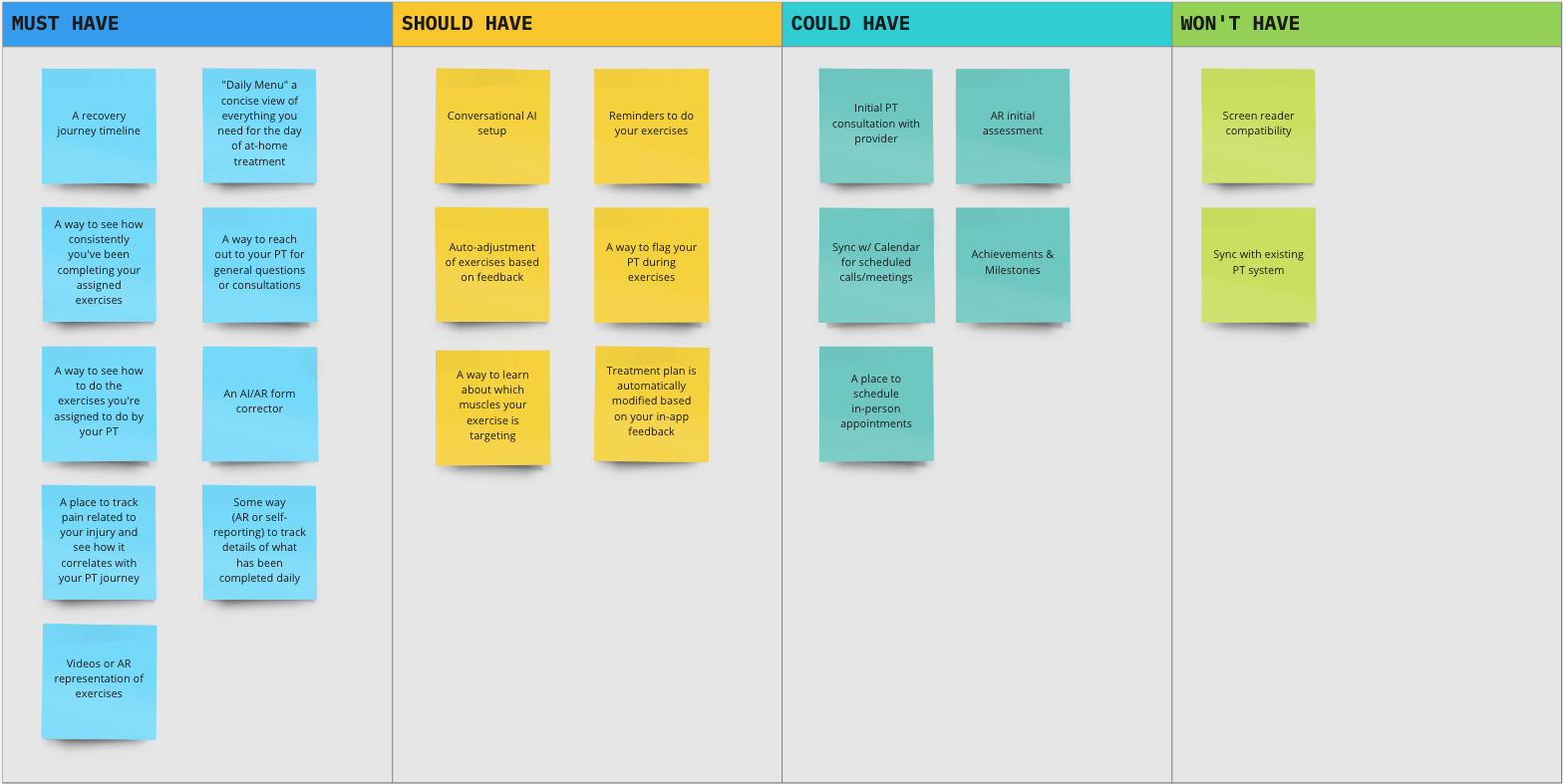
Honing in on what we wanted to accomplish and working through the pros and cons of each aspect as a team, we laid out a roadmap for the features in our application.
![]()
SKETCHING & IDEATION
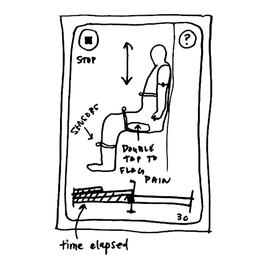
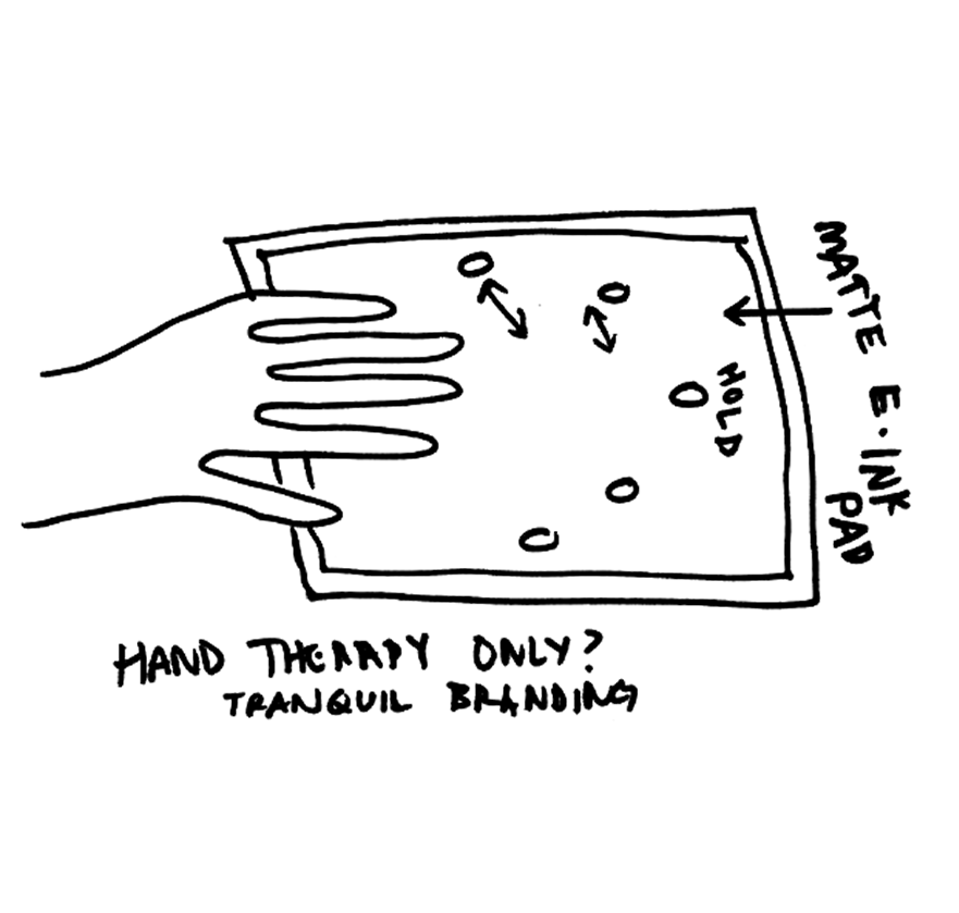
After we developed some functional targets, we got to work defining some of the interactions and visual aspects that might achieve these goals. The team produced sketches and wireframes to review within our group, as well as with our peers, our instructors, and potential users. Some of my sketches are included below:
![]()
![]()
![]()
![]()
![]()
Once we compiled our research, we started brainstorming how our application could incorporate this feedback, and which of these issues we thought we may be able to address most effectively. We relied heavily on Miro whiteboards for this phase of the project, collaboratively laying out our thoughts and discussing as a team how we might approach these insights.
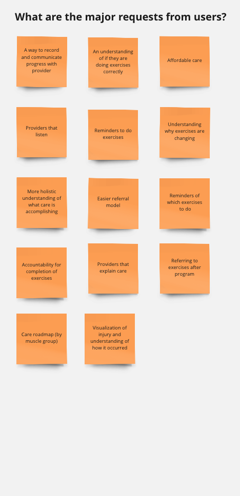
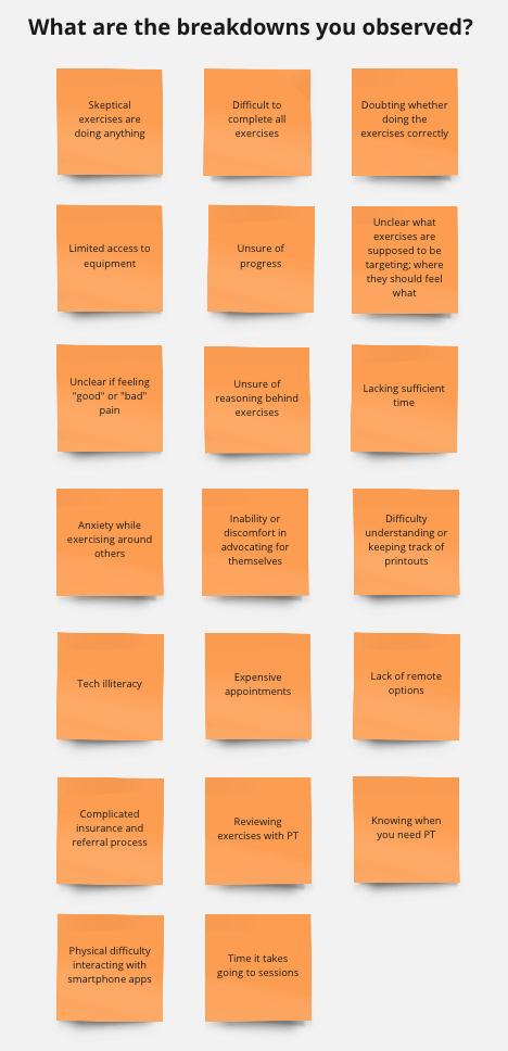
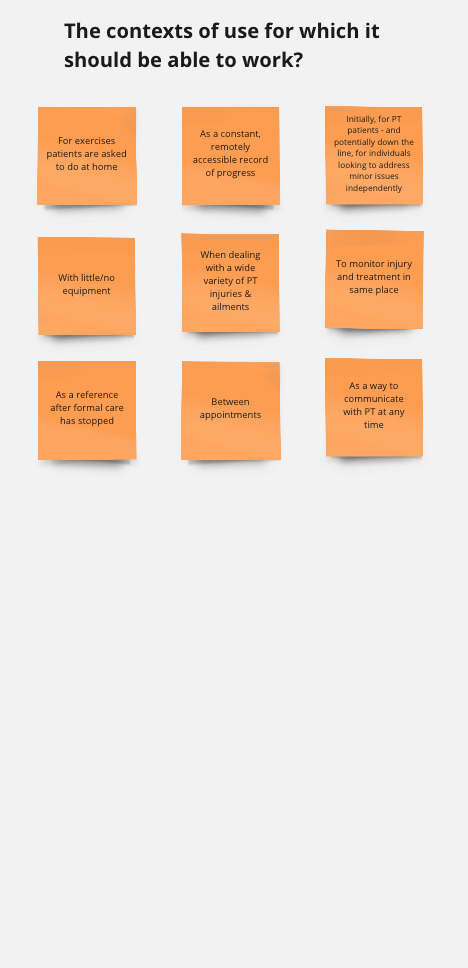
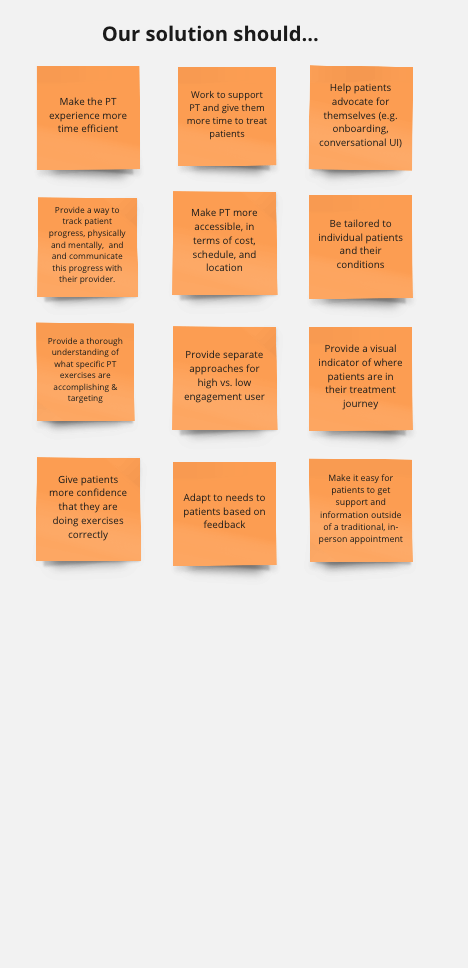
Honing in on what we wanted to accomplish and working through the pros and cons of each aspect as a team, we laid out a roadmap for the features in our application.
SKETCHING & IDEATION
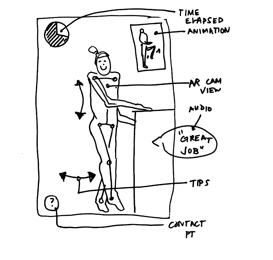
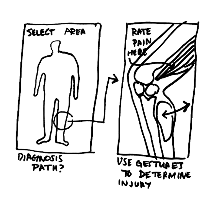
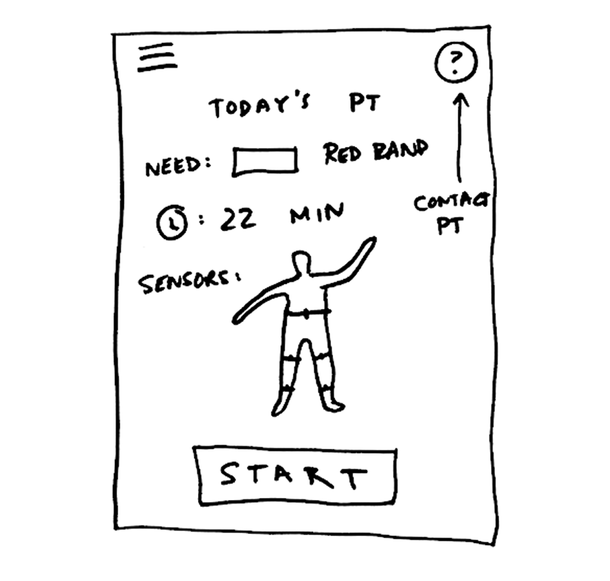
After we developed some functional targets, we got to work defining some of the interactions and visual aspects that might achieve these goals. The team produced sketches and wireframes to review within our group, as well as with our peers, our instructors, and potential users. Some of my sketches are included below:
USER FLOWS
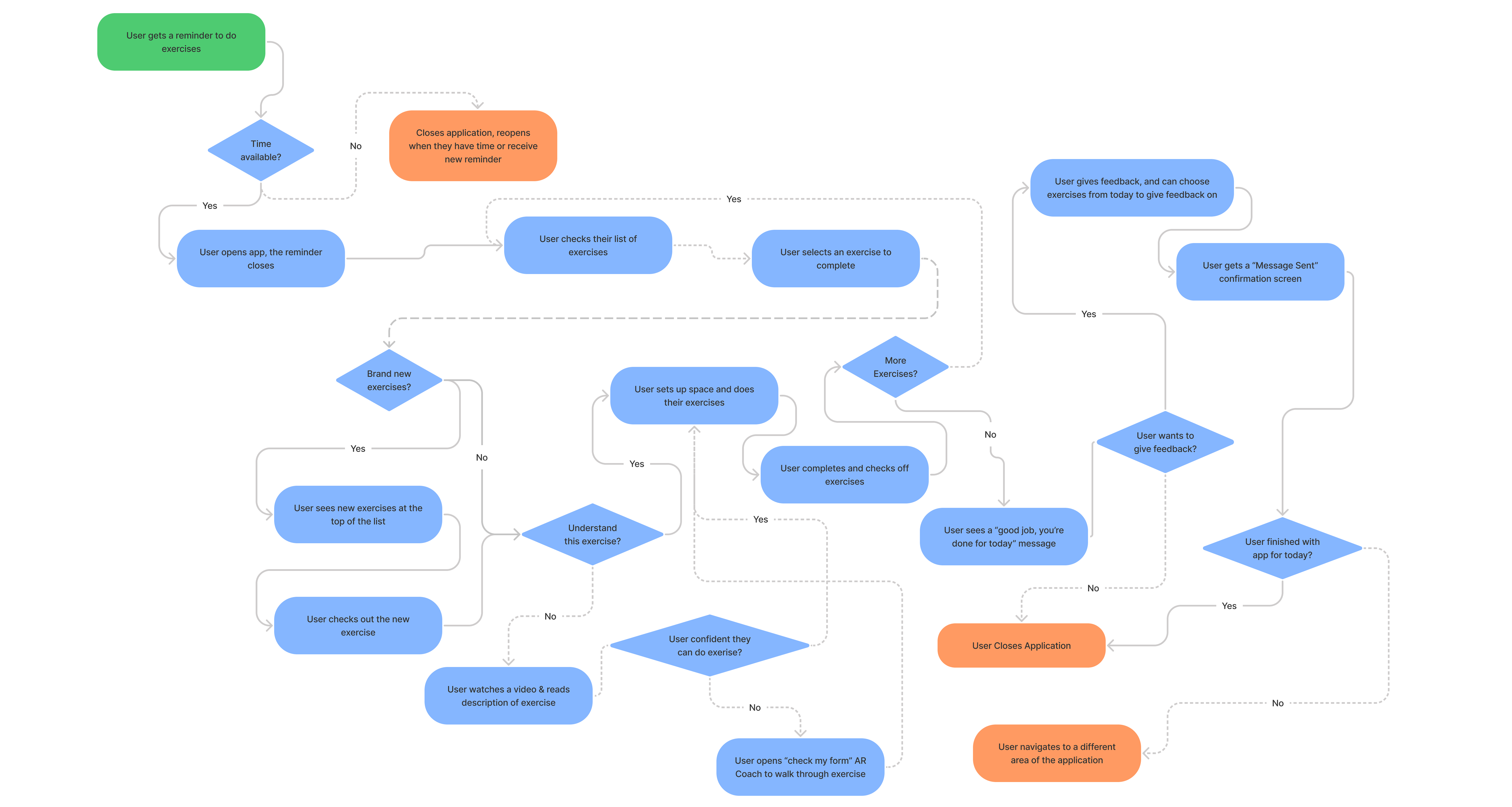
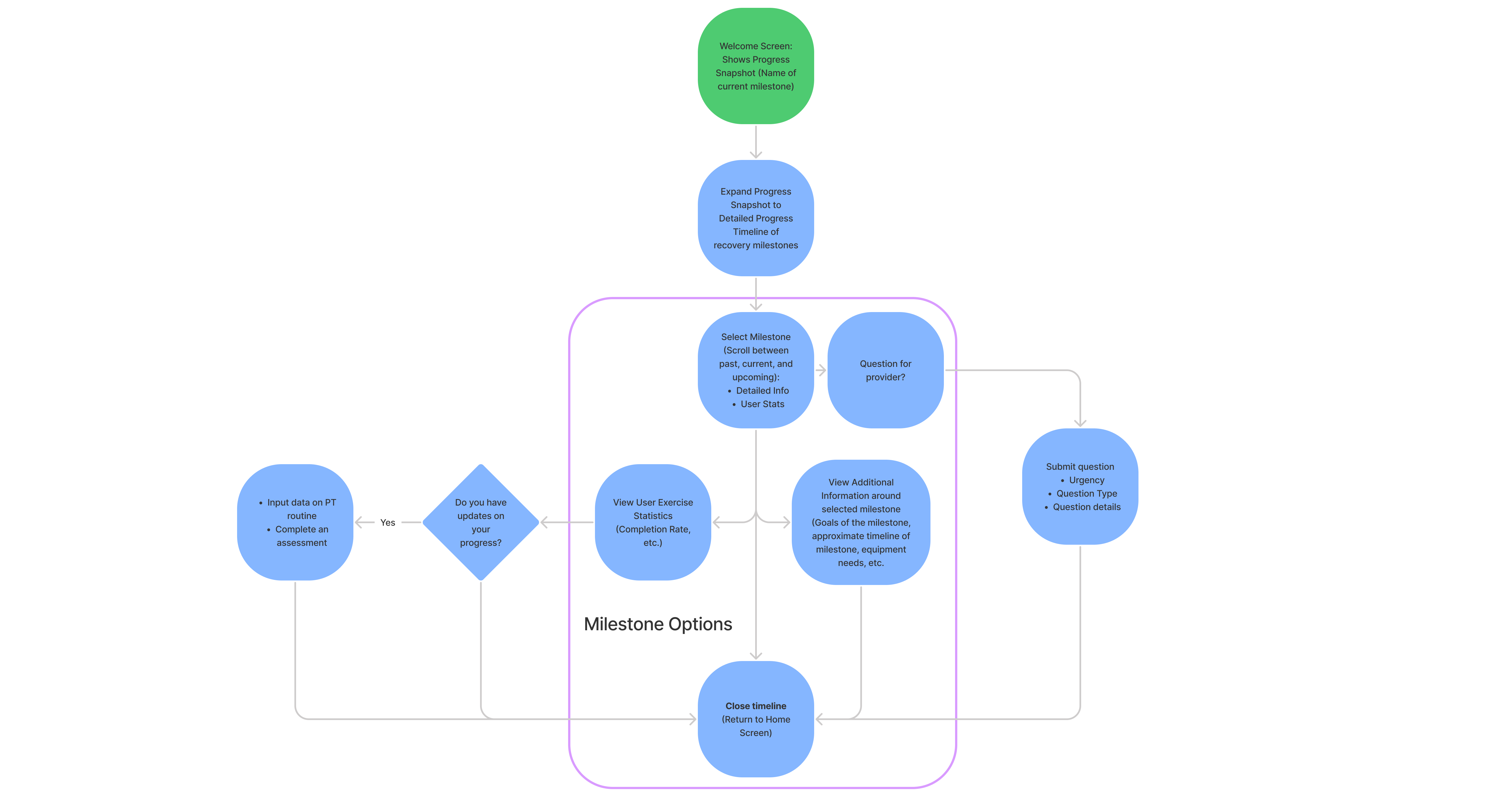
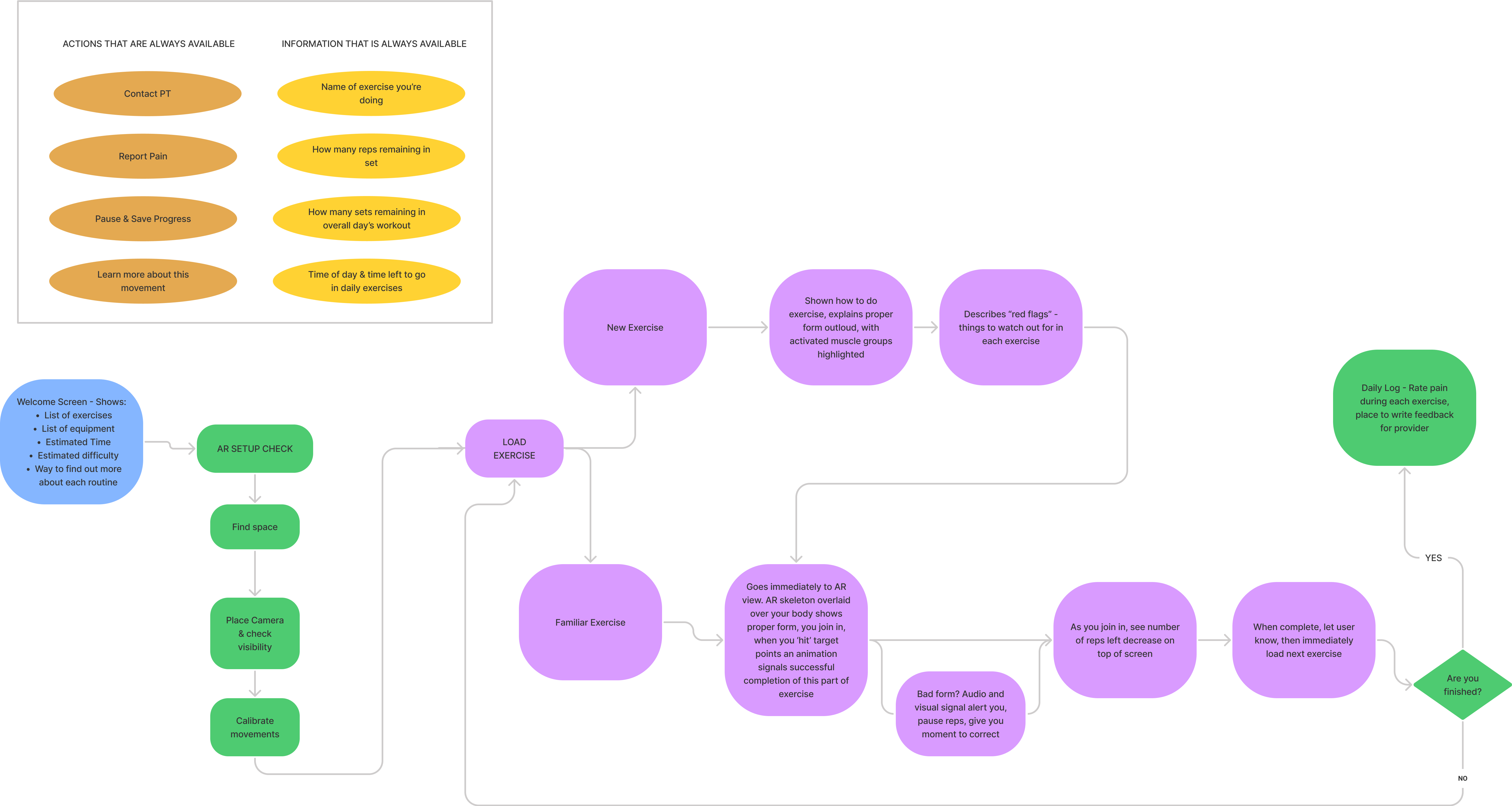
Our team started to think of the application as a series of actions a user needed to take - to contact their therapist, view and complete their exercises, and see their general progress in treatment and status. We began to work through some of these processes as flow charts to structure the development of our prototype.

PROTOTYPE
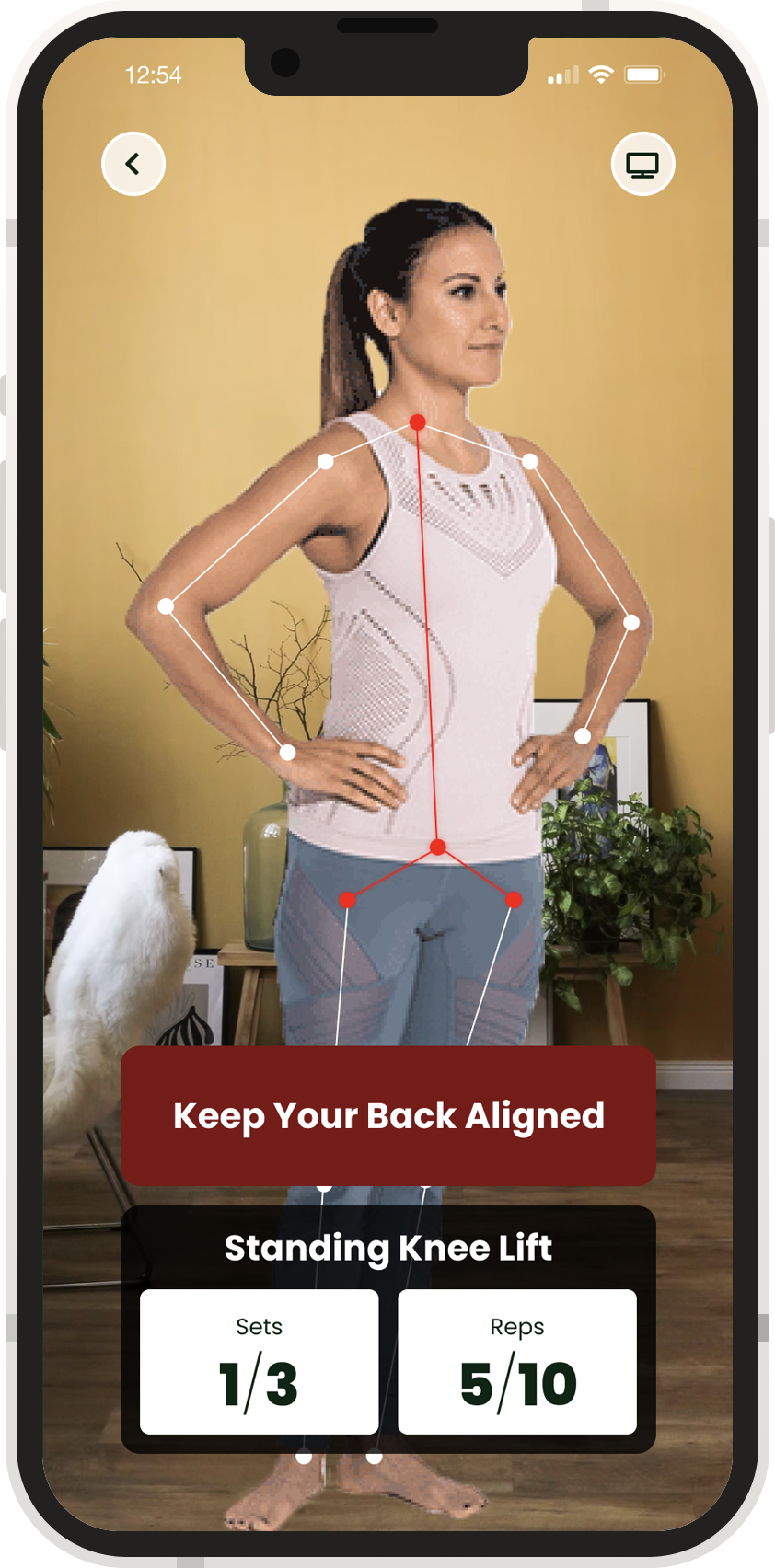
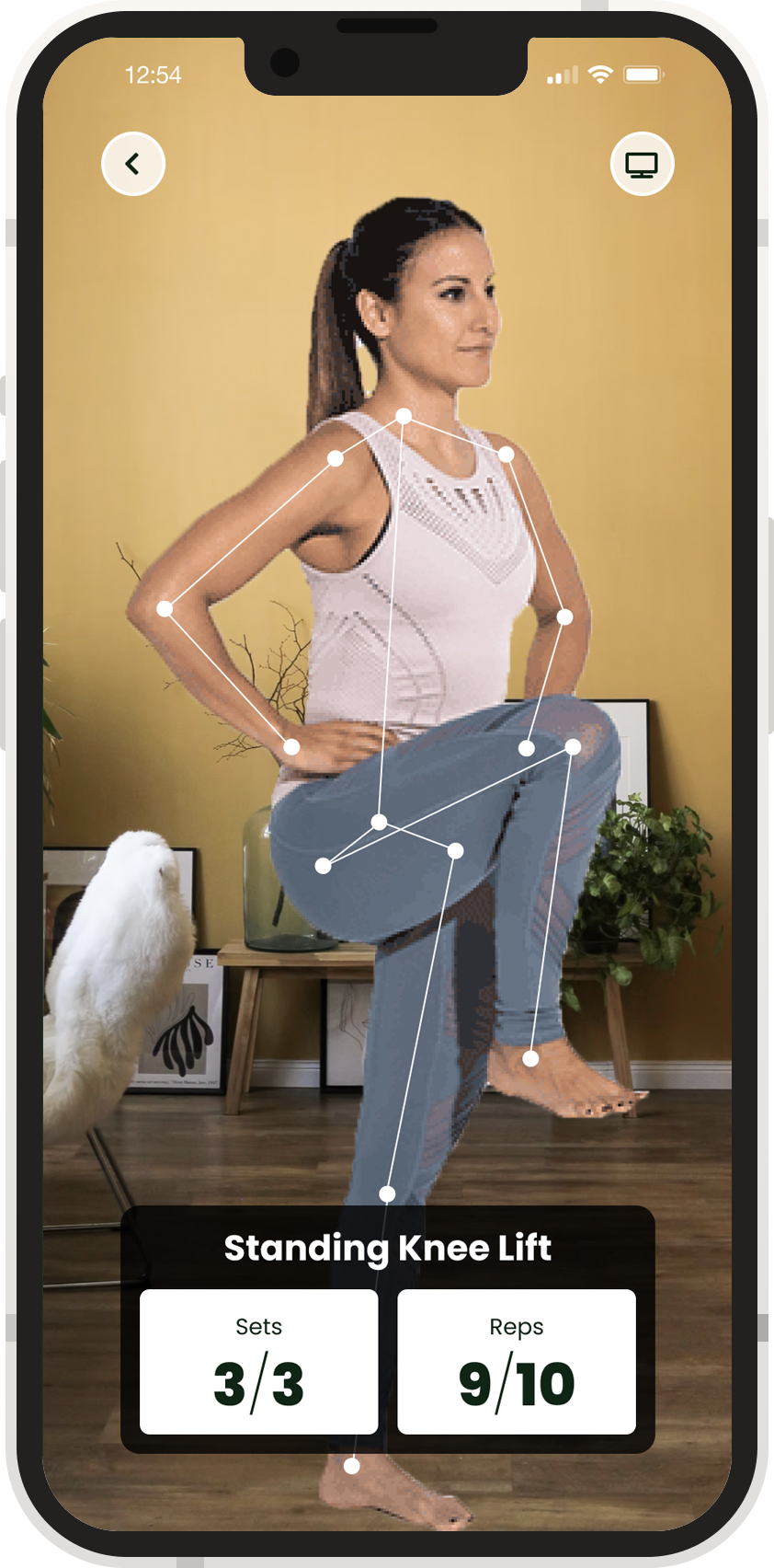
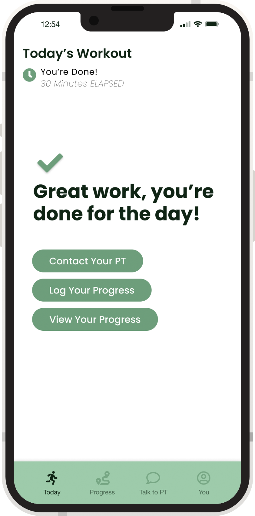
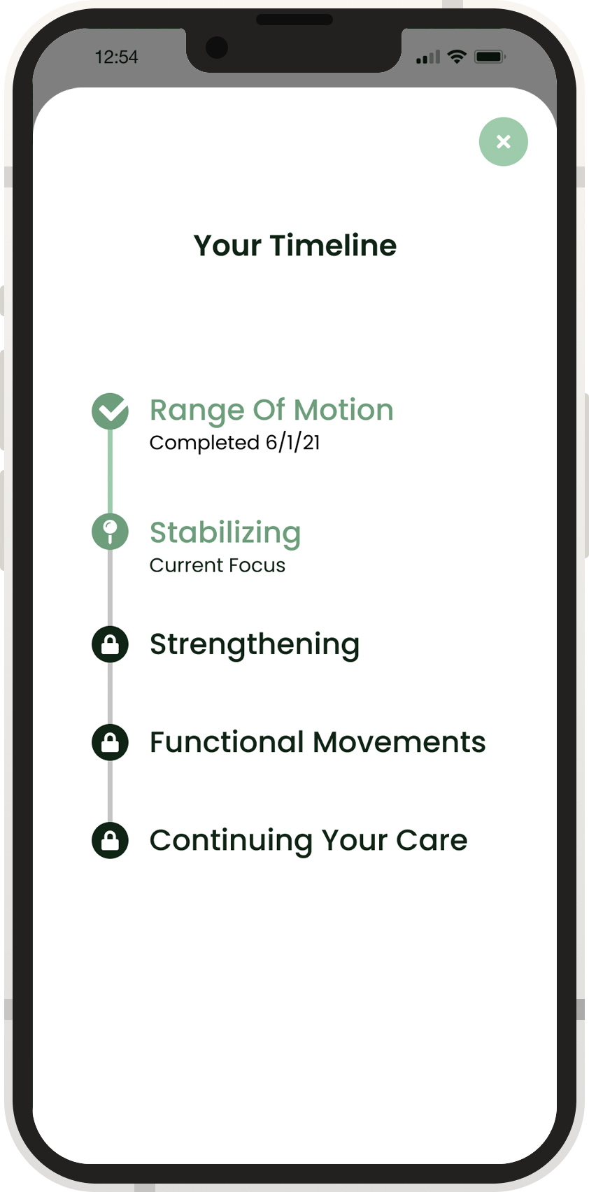
Finally, our team was ready to build out our prototype! Working together in Figma, we iterated our screens and interactions and watched our ideas come to life. Throughout the prototyping phase, we gathered feedback from peers and users and refined our user experience and visual language.
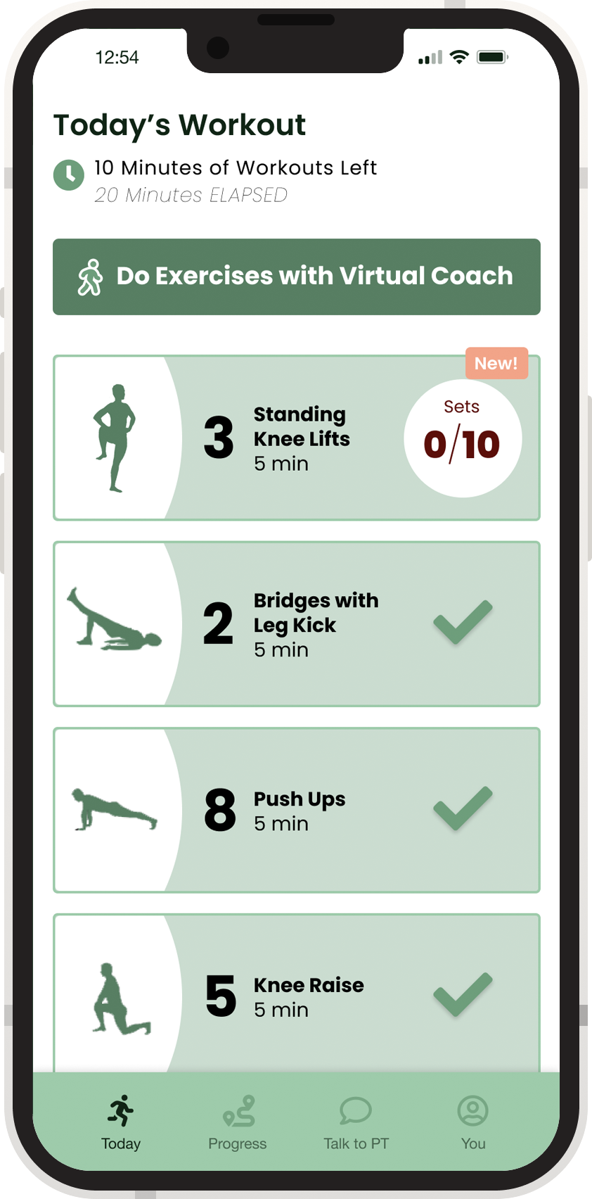
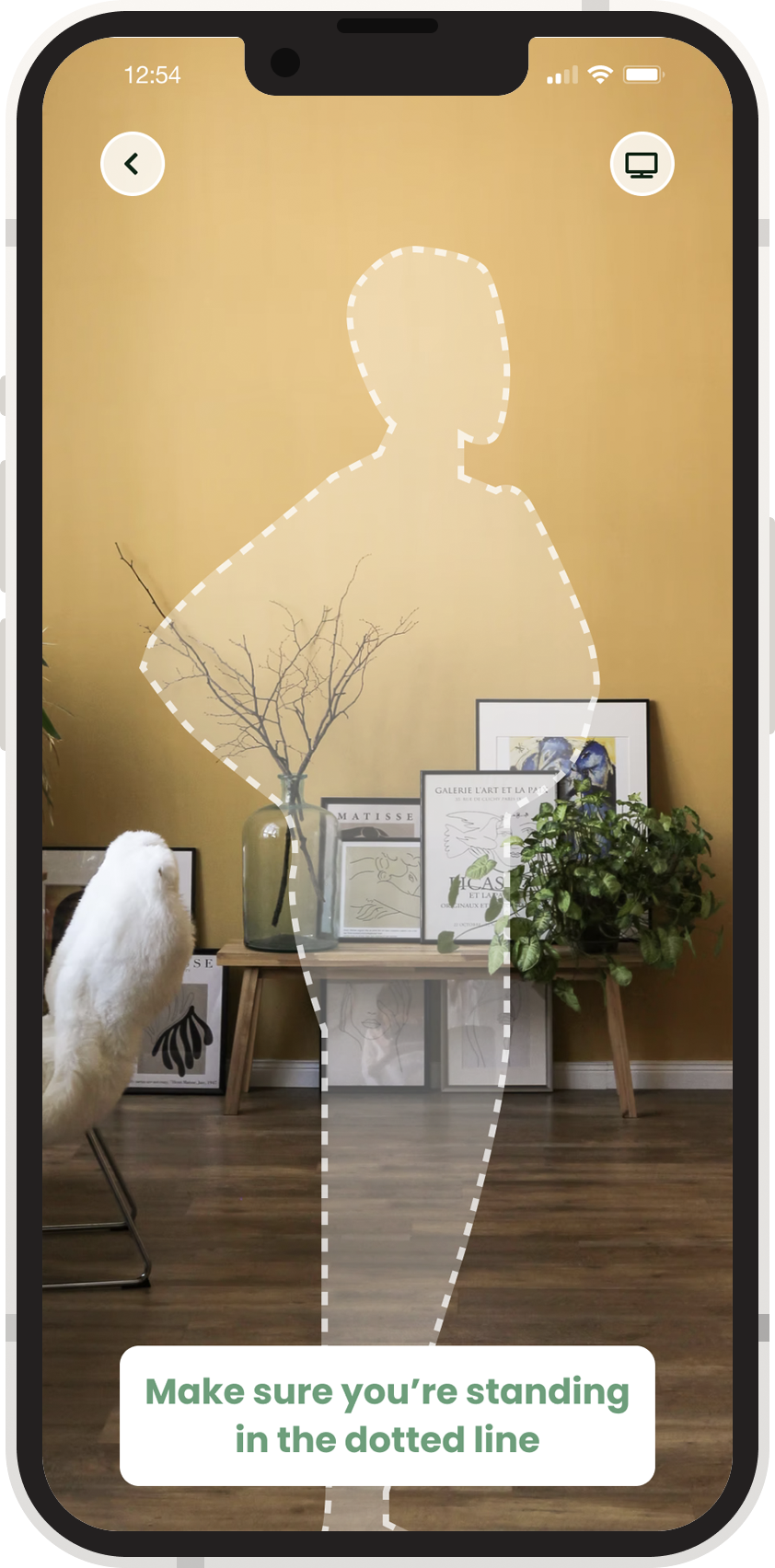
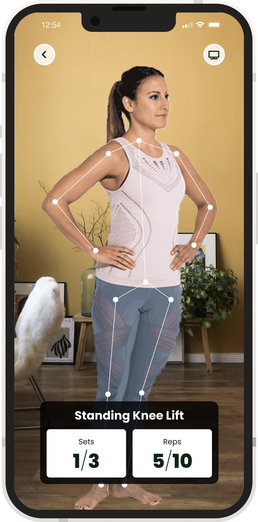
Still images from the prototype can be flipped through below. We tried to keep the color palate limited, keep text to a minimum, and make it easy for users to get more information.

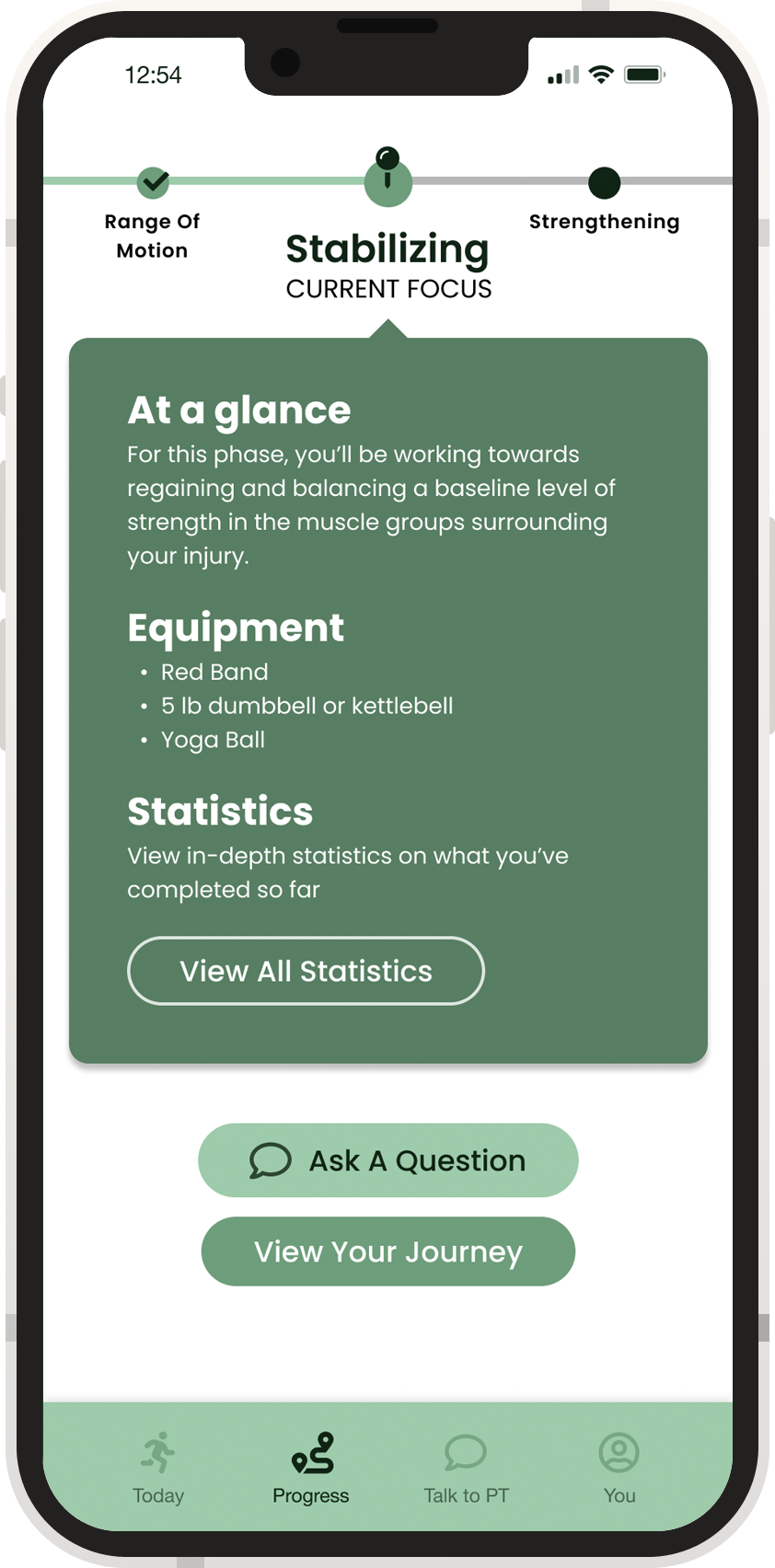
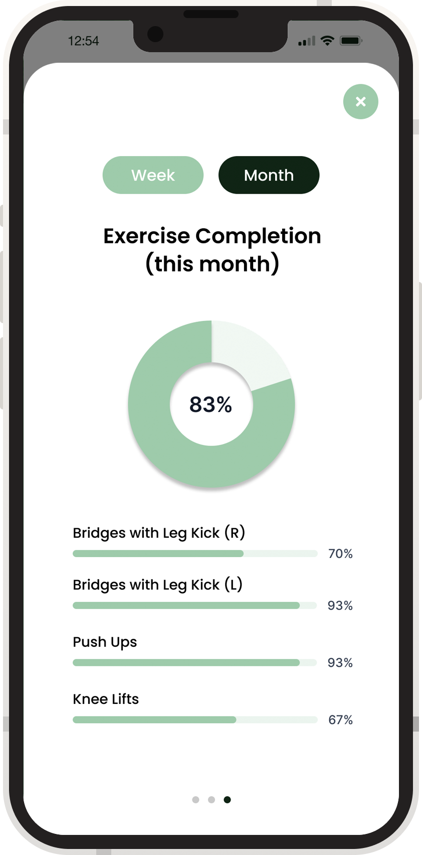
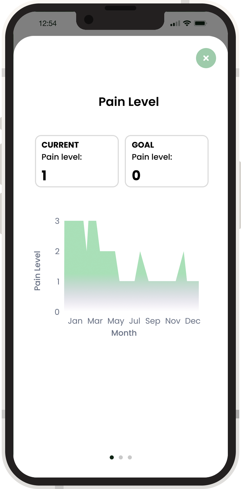
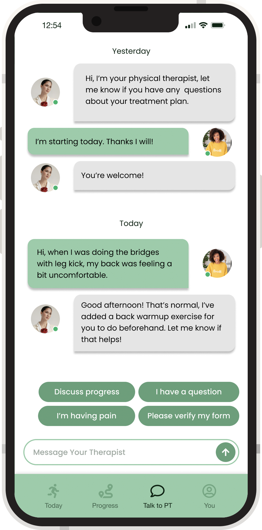
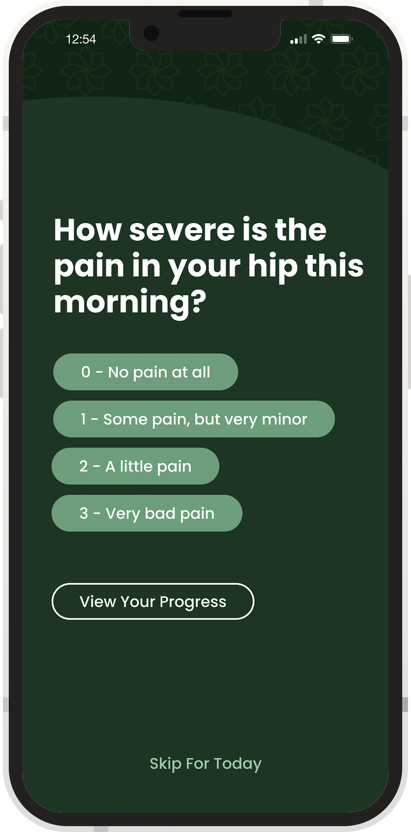
For our class presentation, we made a promotional video for our application, highlighting the narratives of our potential users.
